Categories ArchivesVisual Identity Design

The good logo image

The logo is the central part of any visual identity.  A good logo deliver a powerful and effective message about brand’s values. The 3 key conditions of the good logo are:   The good logo is unique and memorable The good logo stands out and identifies in the market crowd. It is the visual representation of the business identity and not a merely decorative object. Logos using common symbols such as globes, arrows or swooshes can hardly distinguish among hundreds of other logos having the same elements. Relevant graphic symbols and unique typeface are instantly recognizable and makes the logo memorable. The good logo is functional The good logo is adaptable to different business contexts and is easy identifiable in any communication medium. It ...

Continue Reading

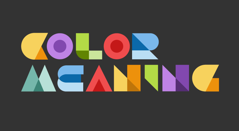
Color Meaning in Branding Design image

color-meaning-in-branding-design

Color meaning in branding design is an effective and commonly used communication tool. The mechanism of color perception is universal among humans, but different cultures assign different meanings to colors depending on their history, religion or habits. Warm colors: red, yellow, orange, brown Warm colors are the most noticeable. Red is vibrant and evokes feelings of vitality, passion and arousal. It stimulates the nervous system to produce adrenalin, hunger or impulsivity. Yellow is the color of sun and warmth. It encourages happiness, friendliness, clear thinking and memory retention. Orange is a mixture of red and yellow and it generates feelings similar to that of its two parent colors. Orange looks adventurous, outgoing, sophisticated and exotic. It shows quality, strength, freshness and ...

Continue Reading

Layout Design – The use of form image

layout design

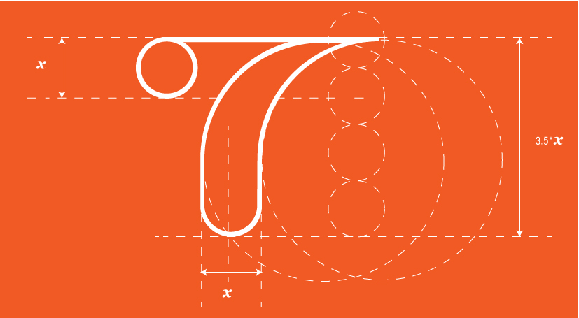
In layout design, choosing the form should be considered as carefully as possible because it is critical for communicating the right message. Form refers to shapes, lines textures, words and pictures. The ability to make form look good and draw attention makes people understand and embrace the meaning of the concept.   Objects and shapes Image: Vicki Li, Iowa State University, US   Form is a message no matter how simple or abstract is. A dot, for instance, is a complex object having the ability to focus attention and provide a reference point relative to other forms surrounding it. A square has equal angles and sides therefore it is analytical, artificial, mathematical and limited; while a circle is natural, endless and complete because ...

Continue Reading

7 Rules of Branding Design image

7 rules of branding design

The 7 rules of branding design are essential for creating outstanding brands. Our design process for visual identity is based on these 7 rules of branding design presented below. 1. Have A Concept The foundation of branding design is the message, the idea, the story or the experience that is to be transmitted. Without a clear message in mind, you will have a beautiful, but useless thing to look at. 2. Communicate! Don't Just Decorate Once the brand concept is clear, it needs to be supported with significant design. Form carries meaning no matter how simple or abstract it is. Choosing the right form, as well as the right color and typography, to sustain the message is essential for a strong visual brand identity. 3. Speak ...

Continue Reading

This is a unique website which will require a more modern browser to work!

Please upgrade today!