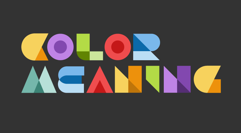
Color meaning in branding design is an effective and commonly used communication tool. The mechanism of color perception is universal among humans, but different cultures assign different meanings to colors depending on their history, religion or habits.
Warm colors: red, yellow, orange, brown
Warm colors are the most noticeable. Red is vibrant and evokes feelings of vitality, passion and arousal. It stimulates the nervous system to produce adrenalin, hunger or impulsivity. Yellow is the color of sun and warmth. It encourages happiness, friendliness, clear thinking and memory retention. Orange is a mixture of red and yellow and it generates feelings similar to that of its two parent colors. Orange looks adventurous, outgoing, sophisticated and exotic. It shows quality, strength, freshness and luxury. Brown is connected to earth and wood. It appears trustworthy and timeless creating a sense of comfort and safety.
Red, yellow, orange or brown are considered “warm” colors and can connect the brand identity to life, heat or aggression, while “cool” colors like green, blue or violet are more passive and suggest cold objects or environments. This perception is though relative. If your design has a hot red near an even hotter orange, the red color will seem cool. Moreover, red is associated in many cultures with meat, blood and violence and it creates the feeling of hunger, anger or energy. On the other hand, vegetarians might associate hunger with the color green. Therefore, the color meaning in branding design and brand target audience has to be carefully studied when picking up colors for a new branding design.
Cold colors: blue, green, violet, gray
Cold colors bring calm and relaxation. Most cultures associate blue with water and, therefore, with life. For this reason, it is perceived as deeply spiritual and contemplative. Blue is also the color of the ocean and of the sky. It appears solid and dependable and it creates a sense of safety and protection. Statistically, blue is the favorite color of most people in the world. Green is the color of nature and vegetation. It is relaxing, youthful and energetic. Violet is mysterious and elusive and, especially in Western world, it conveys authority, status and luxury. The color message is strongly influenced by its hue and brightness. Deep, dark violets suggest death, while cooler, pale violets, such as lavender, are dreamy and nostalgic. Blue-violets are water like and have a calming effect, red-violets, such as fuchsia, are dramatic or energetic and plum-like violets seem magical. Gray is the most neutral color. It lacks emotion and is associated with technology, industry, precision, control, competence and even sophistication.
Black and white
Black is the strongest color in the visible spectrum. It dominates by density, contrast and by its given sensation of formality and exclusivity. Black is suitable to suggest authority, superiority, elegance and dignity. In Western cultures, which are predominantly Christian, black is the color of death and mourning, of nothingness and outer space, while white is associated with purity and cleanliness. In Hindu culture, on the other hand, death is suggested by color white and not by color black. It appears restful, stately and pure. As white is a mixture of all colors of light, it stands for spiritual wholeness and power.