Designing for customer delight can lead to competitive advantage and growth.
“Design is really an act of communication, which means having a deep understanding of the person with whom the designer is communicating.” ― Donald A. Norman, The Design of Everyday Things
The reward for companies that connect with customers’ emotions in a positive way can be substantial. How can we identify the powerful motivators that lead to making those connections?
Emotional design can influence those motivators, paving the way to competitive advantage and growth.
How is Emotion Connected to Design?
Everything around us has been designed in some way and all design ultimately produces an emotion. We experience an emotional reaction to our environment moment-by-moment: a like or a dislike, elation, joy, frustration. We ‘feel’ it. It’s personal.
There is an old adage in the UX professionals’ world: “interaction with any product produces an experience (emotion) whether it had UX or not.” Take industrial design for example and you will find its end products elicited an emotion from their audience, whether good or bad, pleasing or frustrating.

Response > Emotion
Let’s reflect on the definition of UX design: “UX design considers how a user interacts with and responds to an interface, service or product.” That response is an emotion. User experience designers not only strive to design usable, functional products but to also generate a certain emotional effect on the user while they are using a product—usually a positive one 🙂 —and try to maintain it throughout the user journey.
When we talk about emotional design, we’re talking about how a product’s design, or an interaction with it affects the user. In the case of digital design, it’s a moment-by-moment effect “in the flow” and operates on three levels in the brain: visceral, behavioral and reflective. There is a delay between these levels: first it’s visceral, second it’s behavioral and lastly reflective. But more about this later.
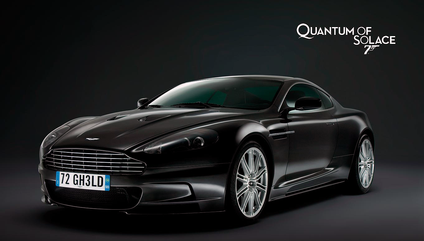
Utilitarianism and Brutalism
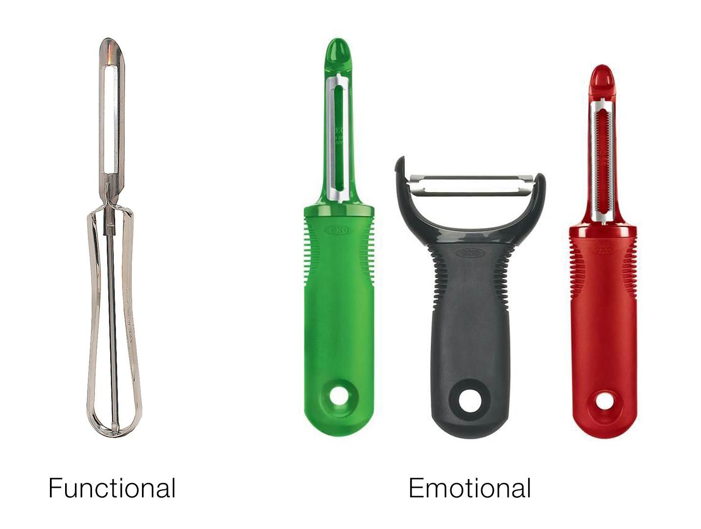
Emotional design is an evolution of “functional design,” or utilitarian design which very much subscribes to the “form follows function” style prevalent since the early 20th century. The idea behind it is that the shape of an object or building should be based mainly on its function and purpose, not its aesthetic.
The twin brother of utilitarianism is brutalism, where not only does form follow function, but is also put together with the least amount of effort, the cheapest materials available and with zero regard to appearance or the human experience. Examples include the the housing estates in London and the concrete and steel housing projects built during the reign of communism in Eastern Europe.

Aesthetics and Perceived Usability
In the early 90s two Japanese researchers studied two different layouts of controls for ATMs. They were interested in finding out how aesthetics affected “perceived usability.” All versions of the ATMs were identical in function, but some had less and some had more attractive interfaces. The researchers found that the ones with attractive interfaces were perceived to be easier to use, i.e. “they worked better.”
Braun, a very successful design and manufacturing company founded nearly a 100 years ago in Germany was famous for its minimalist, elegant designs which captivated people. They were functional but also simple, refined, good-looking and consequently a joy to use.
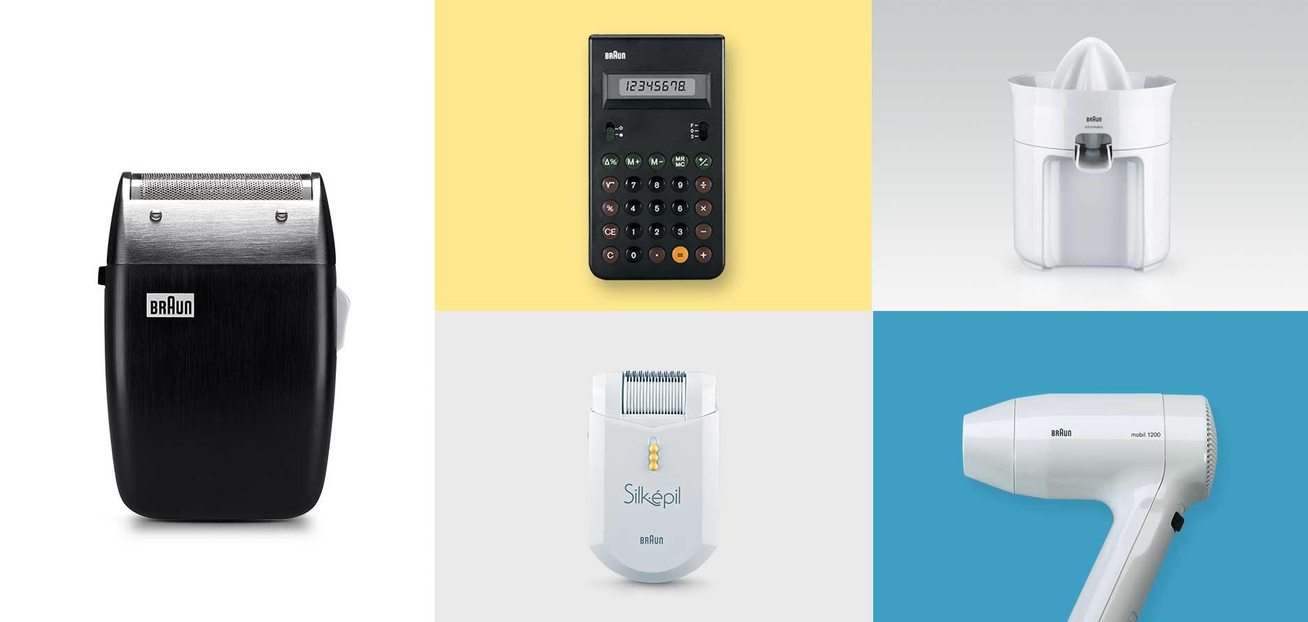
Utilitarian designs that are simply functional and feature-rich do not please people. In this day and age they don’t measure up and no longer satisfy customers.
The Emotional Design Pyramid
Human motivation is based on people seeking fulfillment and change through personal growth as stated in Maslow’s hierarchy of needs, a theory in psychology proposed by Abraham Maslow in his 1943 paper “A Theory of Human Motivation.” Maslow’s pyramid of “self-actualization,” and “self-transcendence” is a pattern that human motivations generally move through. Emotional design can be similarly put on a pyramid that illustrates its importance.
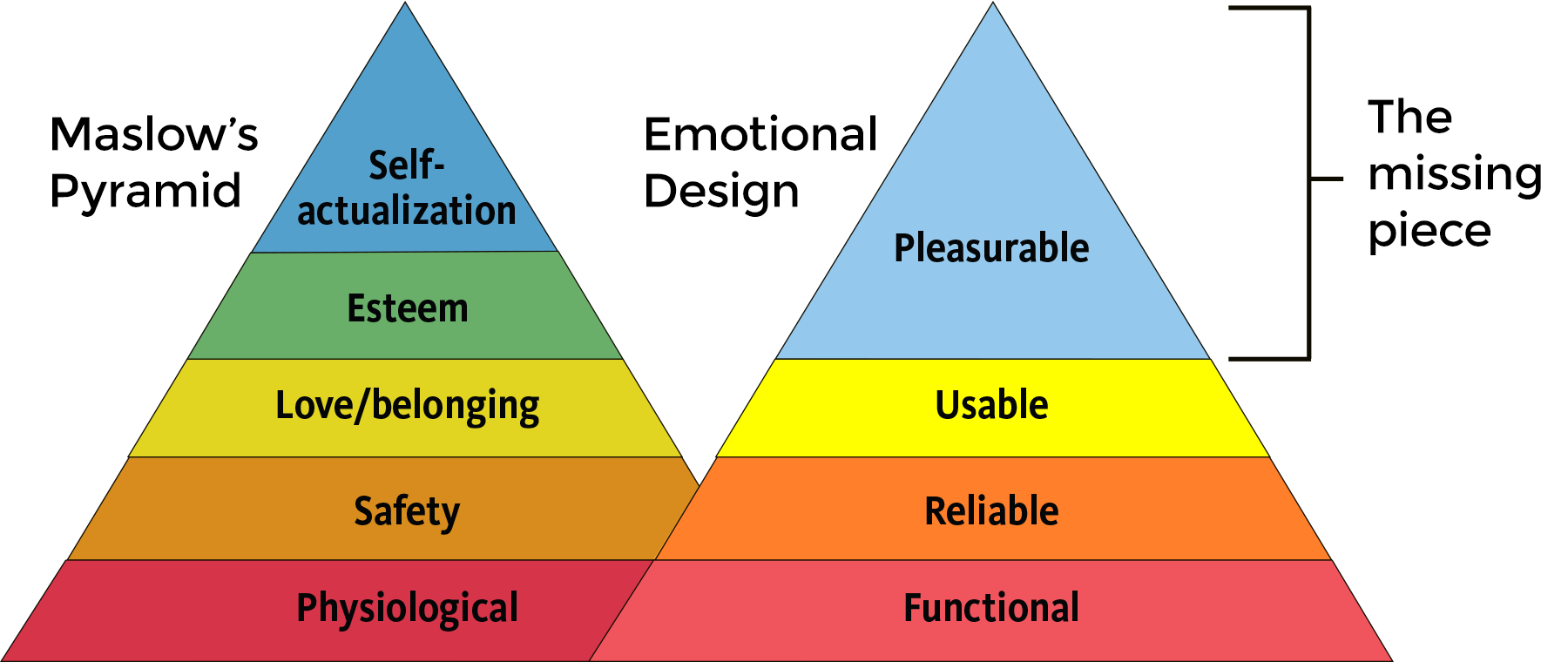
Functional and attractive things are actually perceived by people to “work better.” As we saw earlier with the Japanese ATM experiment, a product’s attractive aesthetic affected “perceived usability.” Furthermore, products that include a pleasing aesthetic and anticipatory design can lead to such a degree of customer satisfaction, that people will forgive minor frustrations when encountering imperfections with those products.
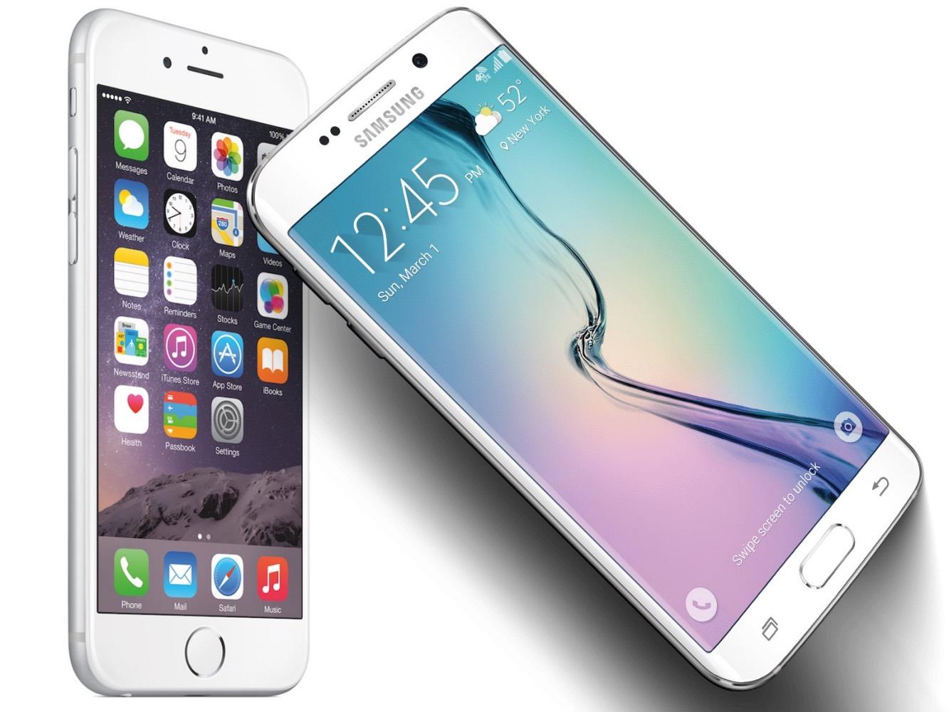
Do we remember Blackberry and Nokia? Something rings a bell but they’re pretty much history. Contrast their designs with the iPhone’s or Samsung’s people-pleasing slick designs.
Emotions and The Brain
Emotions actually change the way the human brain operates. Negative experiences focus the brain on what’s wrong; they narrow the thought process and make people anxious and tense. We don’t feel free and “in the flow.” We feel restricted and frustrated. If a website or an App is badly designed and doesn’t perform to expectations, the feeling can grow into anger. This is known as “computer rage.” Our pulse-rate goes up, we click away from the site and we delete the App in frustration. This is an example of “design gone wrong” producing an extreme emotion. Good emotional design elicits pleasure and a sense of security and safety.
“Design is How it Works”
Why is one product more successful than another? There were plenty of beige-box PCs at the time the translucent, candy-colored iMacs were released in 1998. The arrival of those iMacs signaled more than a renaissance for Apple; it sparked a widespread industrial design revolution.
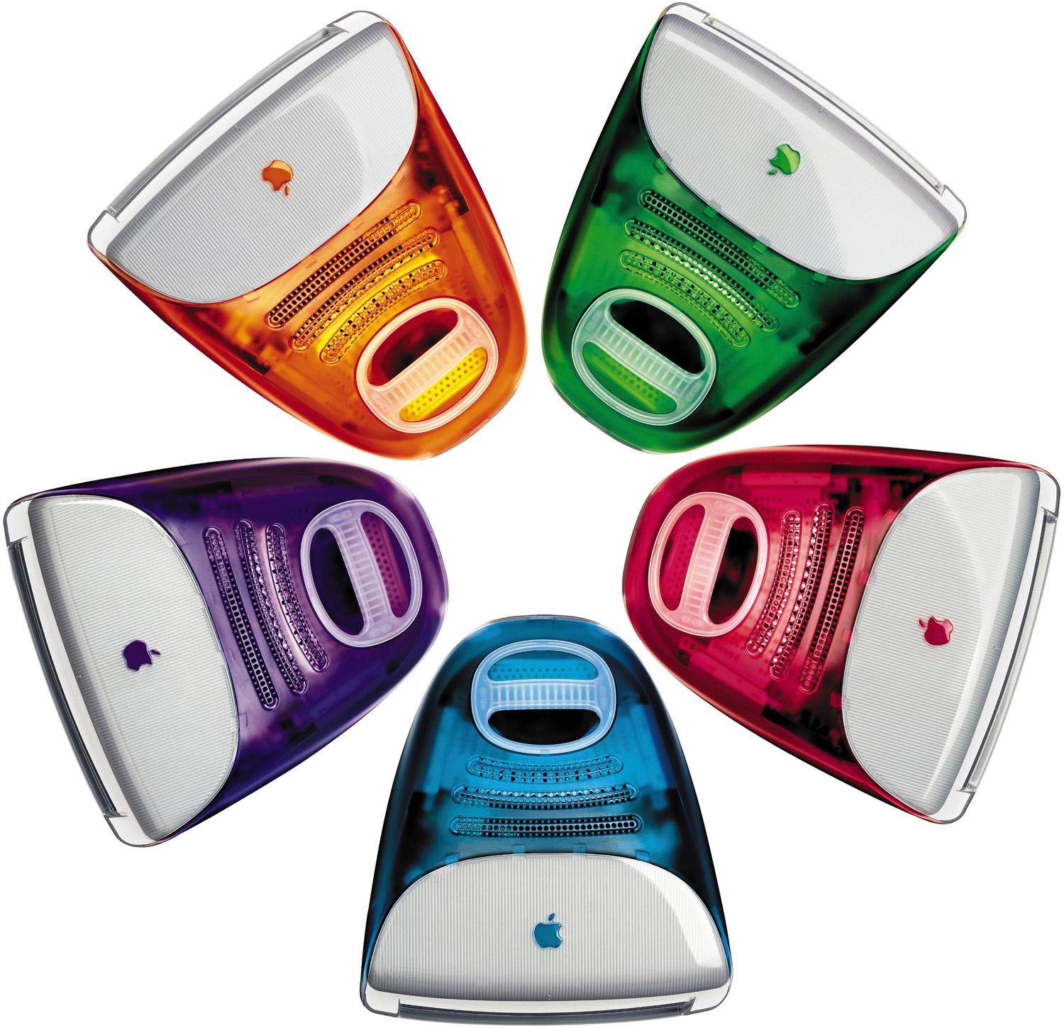
Steve Jobs had the brilliant insight earlier than most that design is emotional. “Most people make the mistake of thinking design is what it looks like. People think it’s this veneer – that the designers are handed this box and told, ‘Make it look good!’ That’s not what we think design is. It’s not just what it looks like and feels like. Design is how it works.” – Steve Jobs, CEO Apple Computer, Inc. in The Guts of a New Machine”

From Passive to Interactive
We didn’t always have “interactive relationships” with the objects and systems around us. They’ve been mostly “dumb,” passive, one-way machines. It’s been mostly one way because the relationship hasn’t been interactive. A car was for getting us from A to B. Now we expect to talk to it; it talks back to us. We’re forming a relationship with it and that “gets emotional.” Generally, we used to press a button and the machine turned on and did something; like the TV or a record player. Now we have Music Apps, interactive TVs and fridges connected to apps that tell us when we need to get more milk.
These days we have an emotional relationship with our “machines” which gives rise to anthropomorphism: the tendency to project intentions, human qualities, behaviors, emotions, and character traits onto inanimate objects. When people form relationships with ‘things,’ there is a potential for negative emotions to kick in when ‘the thing’ is not doing what we want. People start feeling frustrated and no longer in control. Annoyance and irritation may arise with the possibility of escalation into anger if the aggravation persists. Or, at the other end of the spectrum, users feel satisfied and altogether delighted because it puts just what they were looking for at their fingertips and at the perfectly right moment.

How do We Deliver an Ideal Emotional Design That Gives Rise to Positive Emotions?
Customer experience strategies need to include designing for the entire human experience which includes emotion. Use the power of user research and product testing to effectively set up and gauge the emotional effect of the product on users. Doing user-testing, deep research and subsequent touch-point mapping that identifies pain points, designers can identify the frustrations users may encounter while using the product. Not only should designers strive to eliminate these frustrations, but in addition, find opportunities that bring customers pleasure and turn critical moments into positive emotional experiences.
Visceral > Behavioral > Reflective
In order to create a successful product, a design needs to work extremely well on the three levels described earlier: visceral, behavioral and reflective. (Huge nod here to Don Norman’s seminal book on “Emotional Design.”)
Visceral design: “I want it. It looks amazing, so will I.” This is an immediate, deep-level gut reaction to your product. As they say “you never get a second chance at making a first impression.” If at this stage the product’s design induces a positive, instinctual reaction you’re on your way. Visceral design also affects the perception of your product’s credibility, trustworthiness, quality, appeal, and even perceived ease of use.

Behavioral design: “I can master it. It makes me feel smart.” It has to feel good, look good and perform well. It’s about pleasure with a product’s effectiveness of use. Behavioral design is a concept that focuses on how a structure or system, as viewed by the users, meets their needs and requirements. Good behavioral design is like a lock and key. Customers and their behavior are the lock, the product is the key. Perfect harmony is achieved when the two work smoothly.
If something doesn’t work as advertised, it gives rise to an immediately negative emotion. First and foremost products must work well for people, thereby contributing to its users’ satisfaction. If a product’s design does not fit with user behavior it will not last long. Here’s a fact: 77 percent of users never use an app again 72 hours after installing. The most successful apps are those, that as a result of good behavioral design people use on a regular basis and can’t imagine life without them.
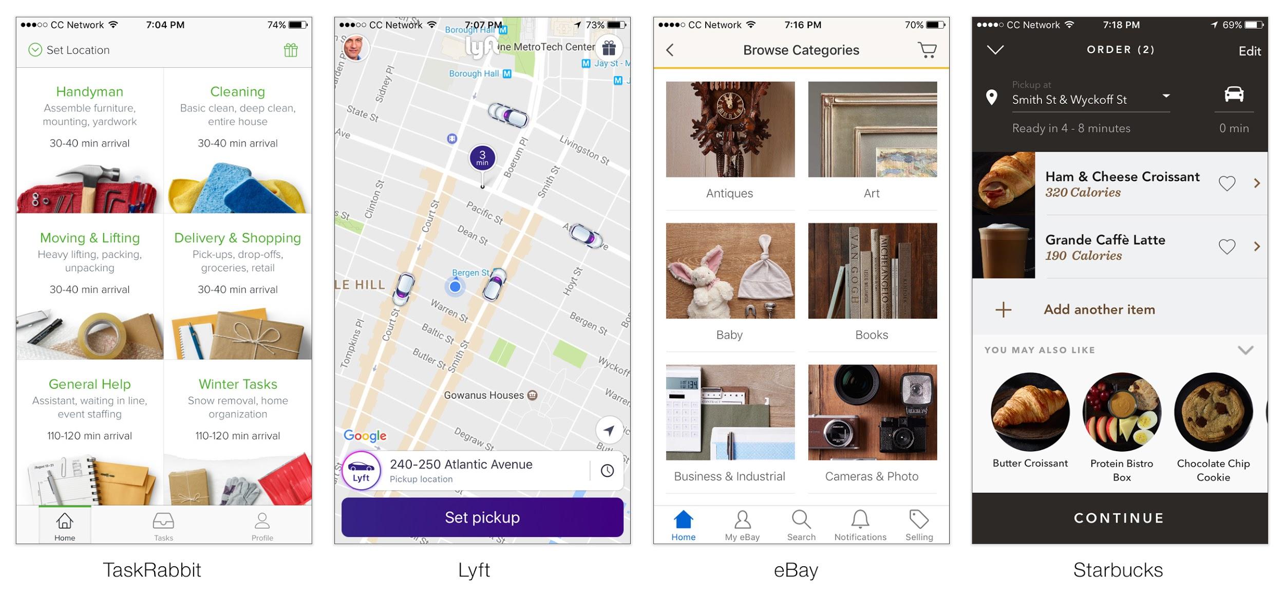
Reflective design: “It completes me. I can tell stories about it (and me).” It’s about self-image, personal satisfaction, memories, reflecting back on the experience. Beauty is a desirable feature of the products we buy. Buying and using a product creates a sense of status in society, it’s about socioeconomic status. Your customers ask: “Is it beautiful? Was it a pleasure to use? Did it make my life easier? How do I look using it, driving it, wearing it?” Do your customers “bond” with your product? For example, good visual design contributes to the perception of improved performance and quality (attractive things work better) and perception of pleasure.

It may seem obvious, but if a design is to be emotional, people need to feel emotionally connected to it. Big brands and their marketers strive to form an emotional bond between their brands and consumers and they spend millions every year to renew that connection. Likewise, designers need to strive for the same emotional connection if their products are to be meaningful and successful.
To that end, product design should try to give products a “personality”; something that resembles the real world and brings pleasure and fun to the interaction.
The World is in Motion
More and more apps use animated micro-interactions and screen transformations to give their Apps a “personality,” to make them seem “alive.” The world around us doesn’t operate with “hard-cuts.” It’s in motion, flowing and fluid; in constant transformation from one state to another. Animated user interfaces mimic the real-world and thus allow users to form a more human-like relationship with digital products via anthropomorphism. They’re more fluid, “alive,” animated; something we can relate to. It starts to get emotional.


Final Words: Functional Beauty and Emotion
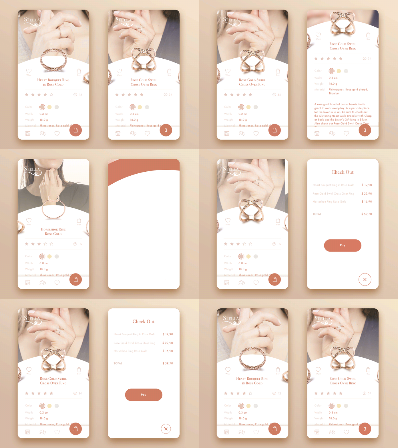
It’s no longer enough to say “We are bringing a software driven product together that will push the boundaries of technology and be functional and useful to people.” As technology levels the playing field, almost anyone can bring together a team and technology to create functional and feature-rich everyday consumer products. What is a more difficult task, however, is having a deep understanding of your customer’s motivations and behavior. Translating them into effective emotional design that is elegant, beautiful and truly unique will play a vital role in delivering an ideal customer experience which in turn will lead to competitive advantage and growth.
This article originally appeared on Toptal.

