UI and UX are two very common design terms; however, these terms often get thrown around in the wrong context.
Meanwhile, traditional job titles such as “website designer” and “app designer” are far less common nowadays, despite being perfect descriptions of the design services that a designer might offer. What is this fascination with the word “UI” all about? And why do some designers call themselves “UI designers” or “UX/UI designers”?
Isn’t the UI a part of the UX?
Why has “UI” become such a buzzword?
UX vs. UI
We, as designers (and as human beings), are obsessed with how things look. We know that it’s “what’s on the inside that counts,” but we still parade ourselves in front of the mirror every morning, trying to look nice for the random strangers we’ll never see again.
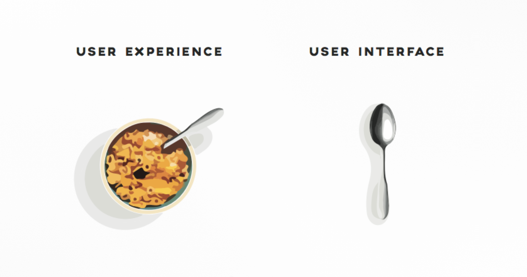
UI design is no different. We want our user interfaces to be aesthetically pleasing, and whether we admit it or not, we like our work to be admired and validated. Since things that are visually appealing turn more heads, this can lead some designers to dedicate more time to how an interface looks, rather than how it works. The key difference between UI and UX is that the UI is how it looks, and the UX is how it works.
By definition from the Nielsen Norman Group, “‘User experience’ encompasses all aspects of the end-user’s interaction with the company, its services, and its products.”
Calling yourself a UI designer is pretty much the same as saying, “I’m more focused on how it looks.” In reality, the user interface is only one contribution to the user experience. There are many other factors beyond the UI that contribute to the overall user experience.
To name a few:
- Does the user flow help the user achieve their objective quickly?
- Can any user, regardless of age or physical capability, access the UI?
- Is the usability good enough that the user can use the website easily?
- Are design decisions being driven by solid data and user research?
- Is the application intuitive enough to guess what the user wants?
Visual design still matters. Colors still matter, branding still matters, and how the UI animates when the user interacts with it still matters, but when we begin making design decisions based on how something looks, we’re no longer designing for users.
In fact, we’re not even designing. We’re making art.

As a rule, the UI is how you interact with a product (e.g., clicks, taps, and voice interactions) and the UX is the resulting opinion/emotion felt by the user (e.g., it’s fast/slow, intuitive/confusing, and/or makes the user feel happy/frustrated).
Why You Shouldn’t “Design for Likes”
Social media is addictive. Why it’s addictive is a whole other story—bottom line, it is. People share things on social media for “likes” because, in short, it activates the reward system in our brain. We seek validation from others in the form of likes and followers much as we seek sex or food—it feels nice, and as the feeling starts to fade, we quickly seek it again to fulfil our desires. The average person spends almost 2 hours per day on social media.
Enter Dribbble, or rather, what’s known as “the Dribbble effect.”
Dribbble started off as a “show and tell” website for designers, but it quickly became known as a way to show off design work for likes rather than constructive feedback. This led to designers uploading work specifically for likes, and this fad didn’t end there.
As with all addictions, designers started to find more ways to feed it, including making up fake clients and app concepts just to have something that Dribbblers could “like.”
What’s Wrong with That?
Design is about solving problems that users face. If we’re not designing with a user in mind, then there is no problem to be solved. If there is no problem, then we’re just visualizing UIs for the sake of it. Not only will we end up with something impractical, but designing for imaginary ideals won’t help us improve as a designer.
Let’s take a look at some design disasters on Dribbble.
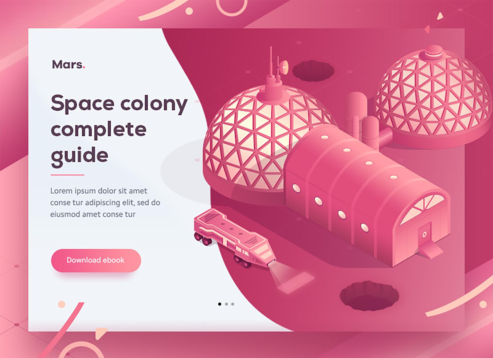
Even though this first example doesn’t form a real design brief/client, and the over-the-top background somewhat takes away from the design itself, what makes this even more unrealistic is that the visual elements extend beyond the viewport, like a kind of “breaking the fourth” wall effect. While the design aims to be “pretty,” it’s not a design that works.


Where Does This Obsession with Visual Design Come From?
Designing for likes is often derived from a love of a specific design trend that’s become mainstream; for example, Apple’s use of flat design and minimalism that effectively saw the end of skeuomorphism. While there is of course nothing wrong with either of those visual aesthetics, designing something purely to implement a trend borders on the job description of an artist, not a designer, and it certainly doesn’t encompass UX.
Instead, first and foremost, UX designers should be looking at how to improve user experiences, and if a visual design trend happens to fill that void, then, and only then should we use it.
As mentioned earlier, collecting “likes” activates the reward system in our brain. More accurately, rewards increase the level of dopamine in our body, and dopamine acts as a neurotransmitter, sending a message to the brain when we reward ourselves. The brain, hugely thankful, makes us feel good in return as reward for our actions.
This causes lazy “designers” to shy away from designing for users and instead implement trends that will result in a high number of likes. This causes misconceptions about what design really is, which causes clients to think the same. This is a huge disservice to the UX design industry and UX designer peers who want to design the best products.
UX Design Principles
It’s impossible to explain the many concepts of UX all at once, but here are the fundamental factors that contribute to an effective user experience, in a nutshell:
- Speed
- Is the app or website slow (or does it feel slow)?
- Is the user required to click/scroll/interact more than necessary?
- Are there too many distractions and/or decisions to make?
- Is there friction that stops/delays the user from getting what they want?
- Intuition
- Is it obvious to the user what they have to do next?
- Can we determine what the user wants and display content accordingly?
- Accessibility
- Can the user access the UI, regardless of their age or disability?
- Have we thought about the many different types of color blindness?
- Usability
- On mobile devices, are the tap targets an appropriate size?
- Are the targets easily accessible to thumbs?
- Is the design responsive? Does it adapt to all devices?

Visual Design Is Still Important
Visual design plays a huge role in user experience design, hence the reason why we shouldn’t compare UI to UX—UI is a part of the UX. Calling yourself a UI designer only brings attention to the more glamorous aspects of UX design while placing less regard on UX as a whole and how it can be used to meet business objectives.
Here are the UX design principles as listed above, only this time, we’ll mention how visual design factors into things:
- Speed
- Can the user quickly identify where they need to look and interact, using contrast, color, and spacingas visual cues?
- Does the above-the-fold UI/content render immediately, explain what the user needs to do on said screen, and have a clear call to action?
- Accessibility
- Do the color choices create enough contrast?
- Is the UI large enough for those with difficulty seeing?
- Usability
- Is there a visual hierarchy that illustrates the importance of each element?
- Are we visually conveying trust and security when applicable?
- Are we implementing micro-interactions that feel natural and clarify the action that’s being taken by the user?
It’s important to think of UI as a tool that can be used to improve UX, rather than a shiny coating that can make UX “look better.” Take Amazon for example: They make over a hundred billion dollars every year, and while their UI and checkout experience is obviously intuitive, it isn’t conventionally appealing in terms of visual aesthetics.

UX/UI Design Should Be Driven by Data
UX design (which includes UI) should be driven by user research (tracking analytics, user interviews, customer surveys), usability testing, a lean UX workflow (that includes prototyping, internal feedback, and regular shipping), and anything else that offers data and insights into how users interact with the interface (or the business as a whole).
If an app or website isn’t performing to expected standards, these qualitative and quantitative user research methods can help UX designers make more effective design decisions, whether that’s a decision relating to the user flow or just the colors. It’s this data-driven approach to design that makes UI and UX one and the same thing.
Conclusion
There’s nothing wrong with being called a web designer or app designer, or even a voice app designer or wearables designer. It describes what you are, and clients will be able to grasp what you do more quickly. Clients don’t care if you have a trendy job title or how many likes a design has on Dribbble. All clients want to know is that you know how to solve user experiences effectively, taking into consideration the business objectives of the company and making design decisions driven by data rather than likes and trends.
On the other hand, there’s not much wrong with the term “UX designer” either—that is, if you consider yourself a designer that designs all types of interfaces. Above all, it’s important that as a designer you choose a job title you truly identify with.

