Financial tools aren’t the most exciting products to use—they can feel cold, boring, and corporate. As complex tools with tons of functionality and customization, most provide insufficient training and education—and don’t even get me started on documentation.
While regulatory obligations often require that financial apps behave in a certain way, there are opportunities to make the experience fun and hassle-free for users while still keeping it professional and easy to use. With the appropriate context, financial apps can offer a pleasant and interesting user experience instead of following the drab status quo model.
With Fisdom—an investment app designed to make investing easy for people without an education in the Indian stock exchange, the client has three main goals:
- Resolve the high dropout rate that occurred before users started making investments.
- Research ways to improve the investment registration process (more on this later).
- Make the app more visually appealing—Fisdom is intended for anyone interested in investing, not just for commercial use.
Fisdom operates differently than most investment apps or services. Typically people invest in stocks, bonds, or a multitude of other things based on…well, anything! Sometimes it’s because they like the company, sometimes because they think it’ll do well, or perhaps because a financial expert recommended it.
In this app, the process is reversed. Users set an investment goal—an amount they want to accrue over a selected period of time. From there, the app suggests various options (using historical data and machine learning) and users can invest towards that goal with monthly deposits.

This investing method removes the complexity of choosing individual investments (though users can still invest in whatever they’d like), which makes it critical that the app builds trust with the user every step of the way. A simple misunderstanding of even basic features could theoretically lose users a lot of money!
Yet because of the wealth of alternatives, the initiative to make the app fun and engaging had to be taken into consideration throughout the entire process. This sharpened our focus on building trust through visual appeal and ease-of-use.
Show Them the Money
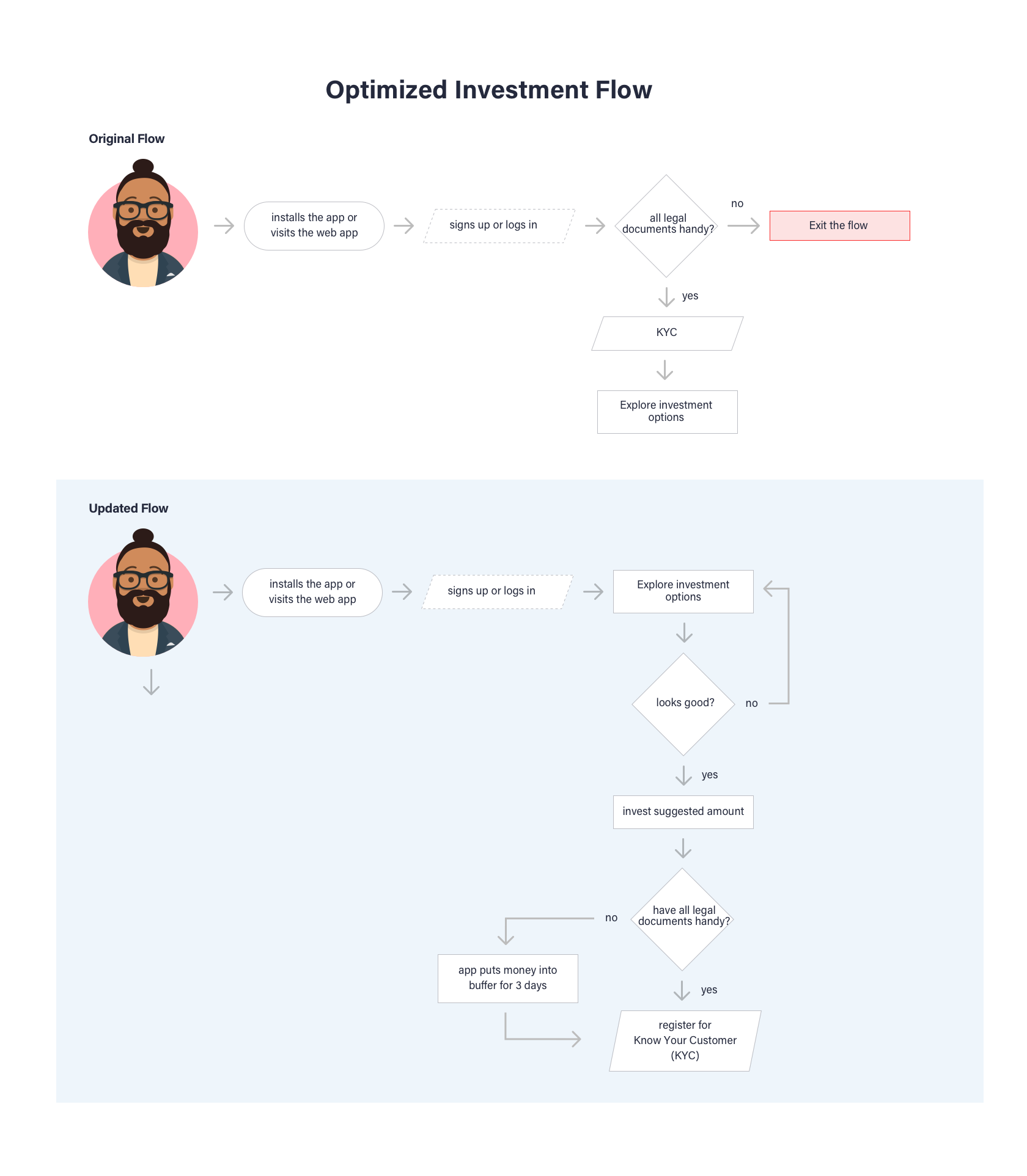
The investment process in India requires that investors complete a one-time Know Your Customer (KYC) form. The form is five pages and requires a lot of information.
Originally, the KYC was a prerequisite for users to make an investment, but in our usability testing, we found a significant dropout rate during the process. It was obvious that the KYC was too cumbersome, and the process of completing the form needed an overhaul.
So we moved the requirement for KYC registration to the end of the process.
While regulatory requirements state all investors must complete the KYC, users needed time to build trust with the app first. To establish that trust, we turned the process inside-out: Allow users to try the app, make their investment decisions, and when ready to invest, complete the KYC form. In this way, users were given the opportunity to build rapport with the app.
We even went one step further and gave three days for users to complete the KYC after making their investment decision. Their money, safe in escrow, would be refunded if the form wasn’t submitted.
Design for Data Entry
This still left a significant challenge: Actually filling out the KYC is a ridiculous process. It’s five pages of a lot of personal information, all of which needs to be typed on the phone!
During the research phase, we found that there were a few government-approved APIs that scan for and provide essential personal information. Much of this data worked perfectly for the KYC, so users could save significant time by either scanning their tax permanent account number (PAN) card or by entering the PAN manually (all Indian citizens have a PAN).
This cut the time to enter required data into the KYC by half…at a minimum! Users who already completed the KYC were automatically 95% complete and only needed to confirm their information and provide a digital signature.

Users who didn’t complete the KYC still had to provide their essential information, so it was important to make input easy and fast. This included simple usability tricks like showing the number pad keyboard for number-only entry fields, using the camera to scan documents or cards where available, etc.
Fintech Apps Don’t Have to Be Boring
During the competitive analysis of other apps in the fintech space, it was clear most of them had bland color palettes and uninviting experiences.

When learning anything new, being bombarded with information can be overwhelming, which makes most users leave before they begin. Minimalism in design is not about flat color palettes and non-skeuomorphic buttons—although often that helps—it’s about how information is structured and the cognitive load required to use the given features.
Investing is hard enough, so we made a conscious effort to keep things simple, both for process and interaction. Subsequently, the visual design turned out wildly different compared to other fintech tools.
“Investing” in the Visuals
We did so by creating a palette that sported bright hues to support the light and playful concept of the application.

Vivid graphics and illustrations enhance the experience, which is important in order to make a dry subject like investing more exciting. This is especially challenging for an investing app, not only because the content needs to be open and easy to understand, but also engaging to promote usage.

From the get-go, it was important to set a playful tone—colorful sign-up screens convey a distinct personality and small transition animations help increase engagement. This level of customer experience was uncommon for the client, so we delivered detailed animations as specs to the development team so they could better understand our design strategy and how they should implement our designs.

Investing long-term is daunting, and few of us know exactly where we want to be financially (aside from “I want to be rich”). To help simplify the process, we added visual associations to all financial goals. This made the choice easier to understand.
As a side benefit, visualizations also provide a way for users to learn about those options and make better-informed decisions for investing their money.