Buttons. With them, we finalize shopping on the internet, we log in to our bank app, and we submit forms filled with our most personal information. Web design is growing at an incredible pace, and styles seem to change from month to month. In just a few years, we have gone from text links to skeuomorphism to flat design. Navigation is one of the most important elements of web design, and the call to action button is its strongest tool.
In this article, I will trace eight years of web button design history based on Dribbble.
The Dribbble Buttons Timeline
In 2009, Dribbble was created: a platform for designers from around the world who shared little pieces of their current projects. Using Dribbble, we can follow the story of button trends and design across the last eight years. I’ve gone through a few thousand Dribbble shots to create an interactive timeline of button styles:
Click the button above to browse The Dribbble Timeline
2009
In this year, the internet celebrates its 40th birthday, and the first “shots” appear on Dribbble. The design of buttons is dominated by greyscale. Delicate gradients, rounded corners, and shadows appear in almost every button design. This aesthetic refers to native system buttons.

Wojciech Dobry, Dan Cederholm, Josh Bryant, Dribbble, Sarah Parmenter, Matthew Smith
2010
The year in which Instagram is created. The form of buttons do not change drastically, but there are many more colors, more details (such as inner shadows), and much more decorative typography.
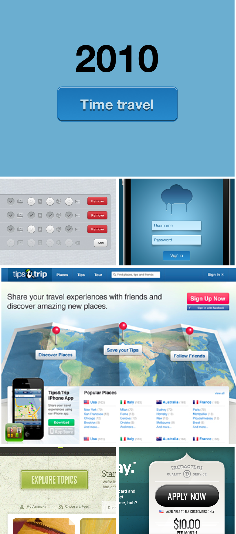
Wojciech Dobry, Morgan Allan Knutson, Troy Bergland, Claudiu Cioba, Liam McKay, Jared Christensen
2011
CSS3 has its premiere this year, and the number of internet users grows to a billion. Skeuomorphism still reigns, and many designers are developing this style in a very creative way. You cannot find any rules for applying shadows or lighting here, but you can be sure that all these elements are present in each project.

Wojciech Dobry, Julien Renvoye, Claudiu Cioba, Meagan Fisher, Josh Hemsley,Jonathan Moreira
2012
The decline and the final form of skeuomorphism, and the shy beginning of flat design. This year is by far the most developed form of skeuomorphism, where some designers have reached the master level in this style while others have started looking for something new.
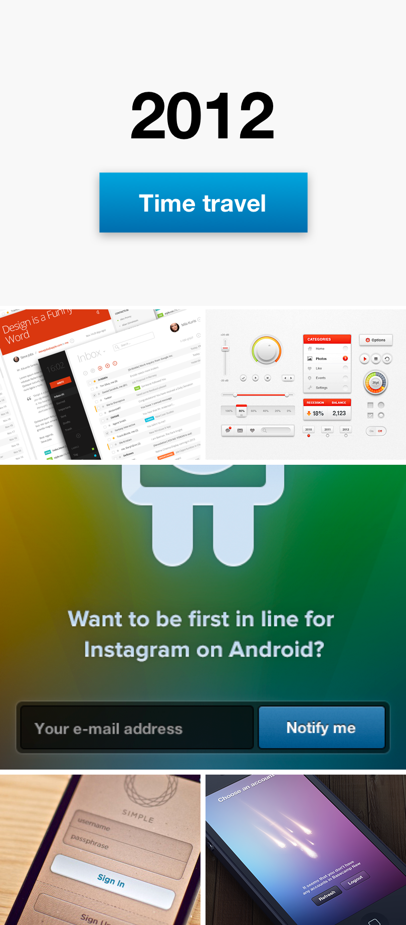
Wojciech Dobry, Eduardo Santos, Mike | Creative Mints, Maykel Loomans, Ian Collins,Dawid Liberadzki
2013
In this year, Apple definitely moves on from skeuomorphism, releasing iOS7. Undoubtedly, this year is the beginning of the trend that continues today—flat design. Almost every single designer on Dribbble—in one moment—abandons any attempt to give a third dimension to their app or web buttons and decides to go flat.
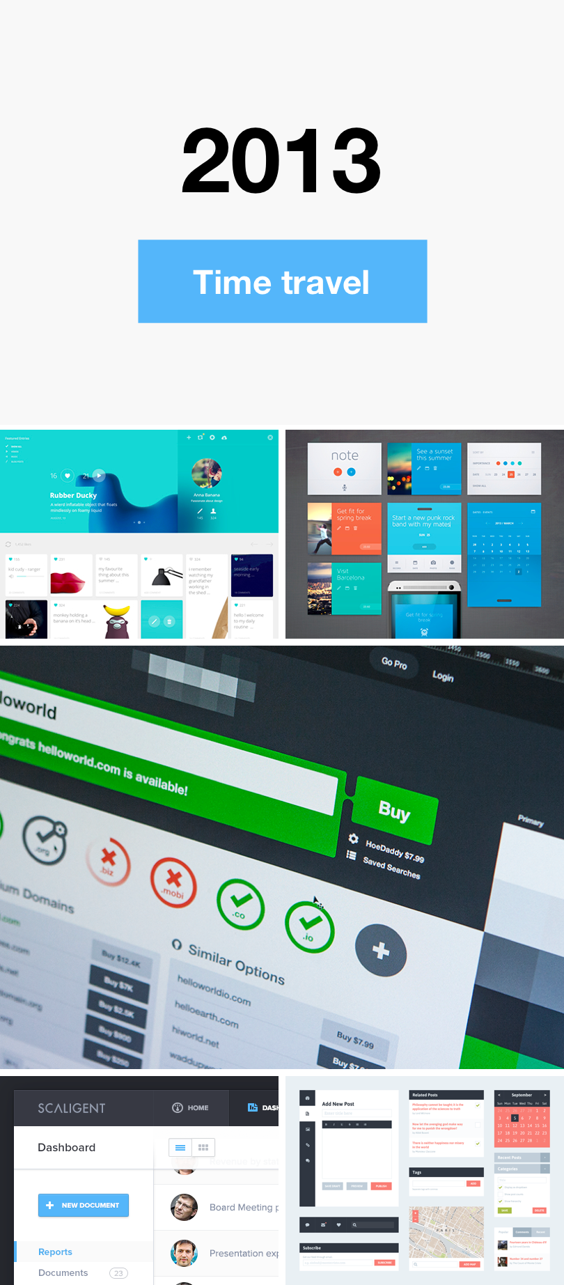
Wojciech Dobry, Cosmin Capitanu, Eddie Lobanovskiy, Jonathan Moreira, Riki Tanone
2014
Google releases Material Design. However, many designers do not follow this style completely. This is a pretty interesting year, because everyone suddenly starts to use ghost button style or flat buttons. They appear in most shots on Dribbble. Two Pixel borders with vibrant colors—that’s 2014.
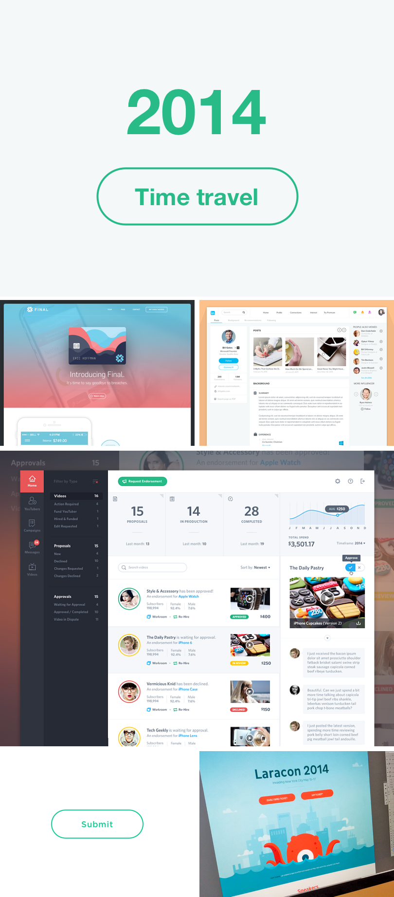
Wojciech Dobry, Eric Hoffman, Ramil Derogongun,Mason Yarnell, Colin Garven, Bill S Kenney
2015
Just a few months after hearing the announcement of Material Design by Google, UI designers fall in love with this guideline. The flat surface of the button with a delicate shadow underneath signals the significant impact of Material Design on current trends. See how many people apply this style to their projects.

Wojciech Dobry, Victor Erixon, Leo Leung, George Vasyagin, Hoang Nguyen, Joshua Krohn
2016
Designers get bored, so they come up with new elements to mix with Material and Flat Design. Gradients appear on the surface of buttons, not to emphasize the third dimension but to emphasize the button material itself. The button gains color shadows and starts to glow.
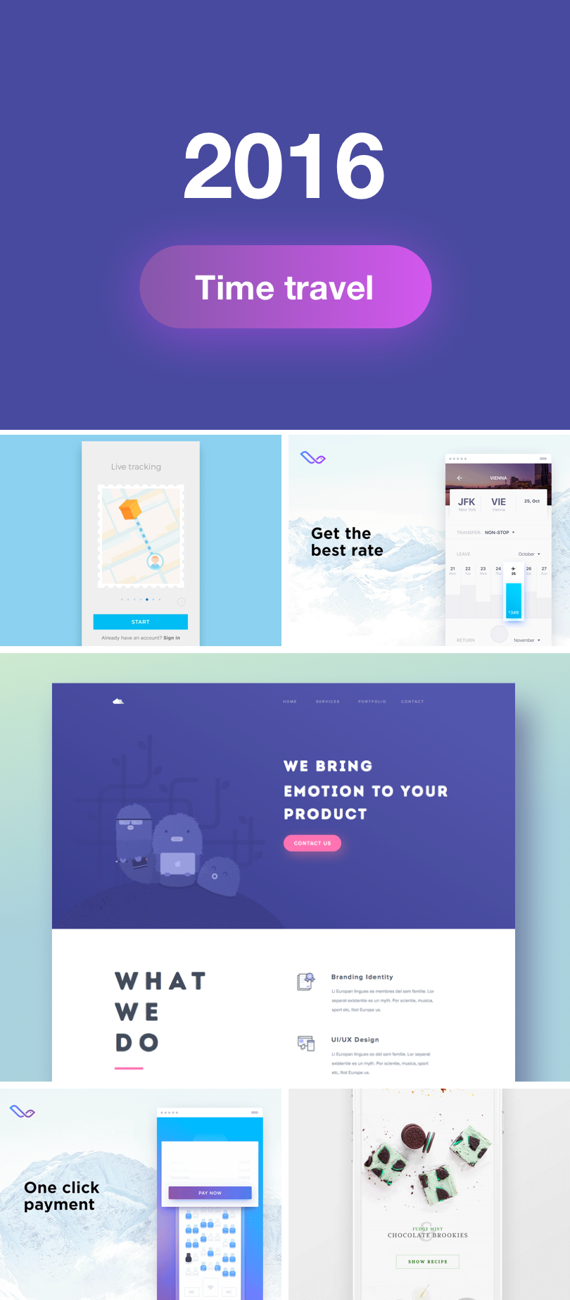
Wojciech Dobry, Anastasiia Andriichuk, Gleb Kuznetsov✈, Ghani Pradita, Kristofor, Ben Mingo
2017
I am very curious how I will look at this year in another eight years. So far this year is, on the one hand, a year of minimalism and flat design. On the other hand, we are still looking for new forms. We are at a stage when we are not technologically limited; we are limited only by the frames of trends and fashion.
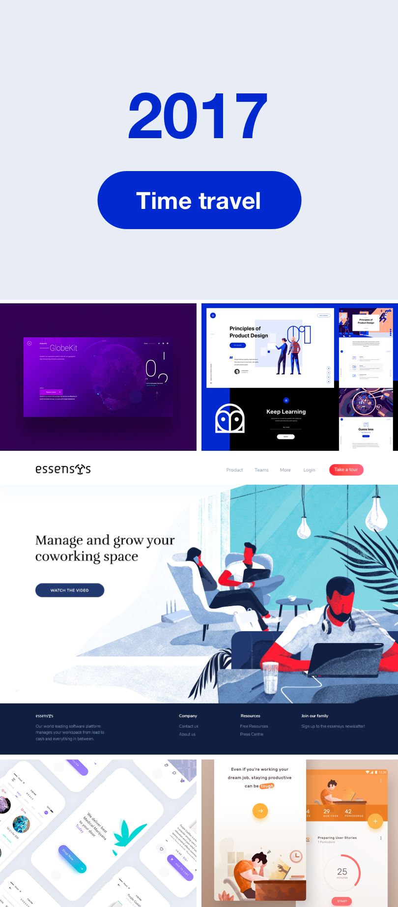
Ben Cline, Anton Aheichanka, Vera Voishvilo , George Vasyagin, Ghani Pradita
What’s next?
How long will button styles continue to evolve? I do not know. I know only that they will. The reasons for evolution may vary—technological change, growing designer awareness, boredom.
There is no denying that buttons are waiting for another change. Maybe this change will be their death? With gestures, intuitive interactions, AR, VR, and sound interfaces, will we still need the buttons that we’ve worked on for years?
This article is written by Wojciech Dobry and originally posted at Toptal

