Landing pages can be described as one-page websites that push the visitor toward a single action. This focus on a single purpose is the primary feature that makes landing pages different from other websites.
Their primary goal is to generate leads which are often linked with email and social media campaigns and to convert those leads into buyers and subscribers. The process of converting visitors into leads and buyers is usually accomplished by call-to-action buttons and lead generation forms.
“A landing page is any webpage on which an Internet visitor first arrives on their way to an important action that you want them to take on your site”
– Tim Ash, Landing Page Optimization
Landing pages originated in response to the poor sales Microsoft was experiencing with its Office suite and have expanded to the point where email marketing solutions, customer management, and lead capturing features are now standard and a powerful tool for retaining and acquiring customers by means of marketing and design techniques.
Although a narrow and somewhat elementary form of customer acquisition and sales, landing pages continue to be one of the most powerful tools that marketers use.
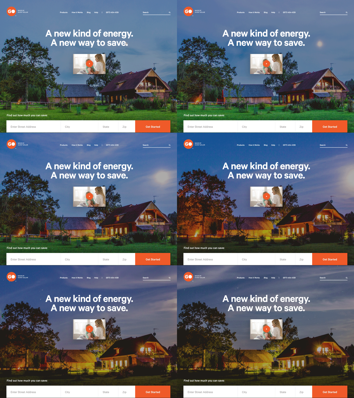
Effective landing pages are used for conversion and sale-oriented tasks, such as:
- Promoting new products
- Growing subscriber lists
- Increasing sales and leads
- Capturing insights and data through forms
Landing Page Design Best Practices
Landing pages, although very similar to common websites, serve a different purpose. Here are the key characteristics that help make a landing page look great and convert well:
1. Visual Simplicity

Visual simplicity takes into account all elements of a landing page’s user interface. Maintaining visual simplicity and a minimalist design is important because it improves visitor focus and helps to showcase the value proposition. Here are some characteristics of visual simplicity:
- Visual simplicity maintains whitespace that focuses visitors on calls to action (CTAs) by isolating them from other elements.
- Visual simplicity makes it easy for the key features and calls to action to stand out.
- Visual simplicity creates contrast by displaying elements in a way that make them stand out.
- Visual simplicity maintains the design flow by placing elements in a way that directs the user to keep reading.
2. A Great Landing Page Starts with Great Media
The right images and videos on landing pages will help persuade visitors to act on the call to action. A great image helps tell the story, demonstrates the product effectively, and creates a personal connection with visitors.

The relevance of displayed images is crucial. Displaying images of friendly-looking, real people instead of generic stock images helps to build trust with visitors. Including relevant product and service imagery gives visitors a better understanding of what they are buying.
Research on the effect of video on landing pages suggests that videos have more impact than still images, where “71% of respondents confirm that video converts better than other content.” Videos help with SEO, maintain user engagement, and better explain the product or service to visitors. Another factor favoring videos is that if used well, they can replace long-winded copy that could potentially hurt conversions.
3. The Importance of Color
Research shows that colors are a big influence on our psychology—on the way we feel and act. Appropriate color palettes improve the user interface and help guide the behavior of users, consequently improving landing page conversions.

Here are few tips on how to use colors effectively:
- Understand how to use high and low colors that allow the creation of high contrast, which is directly tied to copy readability.
- Create a color palette comprised of compatible color combinations and built on complementary/opposite colors.
- Address colors from the perspective of psychology and marketing. Depending on the product/service, use colors that convey the right message (e.g., green is the color that conveys security, trust, and calmness, and therefore, its use is most appropriate for finance-related products).
- Consider color symbolism when targeting different demographics. Various cultures interpret colors differently, so what works for one user base might not work for another.
- Understand that color interpretation varies from gender to gender, and there is no “bullet-proof” solution when it comes to picking one.

5. Landing Page Responsive Design
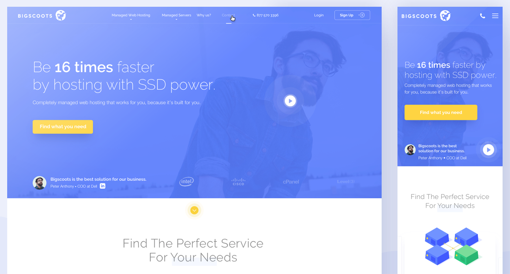
It’s been a couple of years since responsive websites became a standard in the industry, and landing pages are no exception. Responsive landing pages are meant to provide the same level of user experience and UI on mobile devices as they would on full-screen layouts.
Online purchases made from mobile devices are growing, thus mobile phones will soon become a major source of traffic for shopping and purchases made online. Because landing pages are conversion-oriented, it’s important to understand the potential of the mobile audience and adapt towards that traffic funnel.
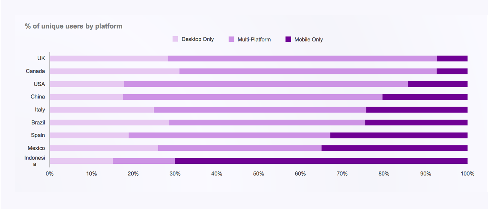
Although most services that provide a landing page have already integrated responsiveness into their templates, if a decision is made to design a freestanding landing page, then landing page design best practices demand that responsiveness is an absolute must. Here’s why:
- Responsive layouts offer feature and content parity as on the main landing page.
- Responsive landing pages benefit from the massive amount of traffic that comes from mobiles and tablets.
- Responsive landing pages integrate well with SMM campaigns that lead traffic.
- Responsive landing pages are easier to build because of the reduced layout complexity.
Content – The Foundation of a Great Landing Page
1. Eye-catching and Concise Headlines
Headlines are the first thing visitors see when they reach a landing page and are an effective way to engage visitors. Consider the headline as a “hook” that either catches or loses the visitor.
You will lose readers if you don’t engage them in the first few seconds they’re on your landing page. Besides making an impression, the headline—being the element that stands out the most—should convey the essential message and the unique selling proposition.
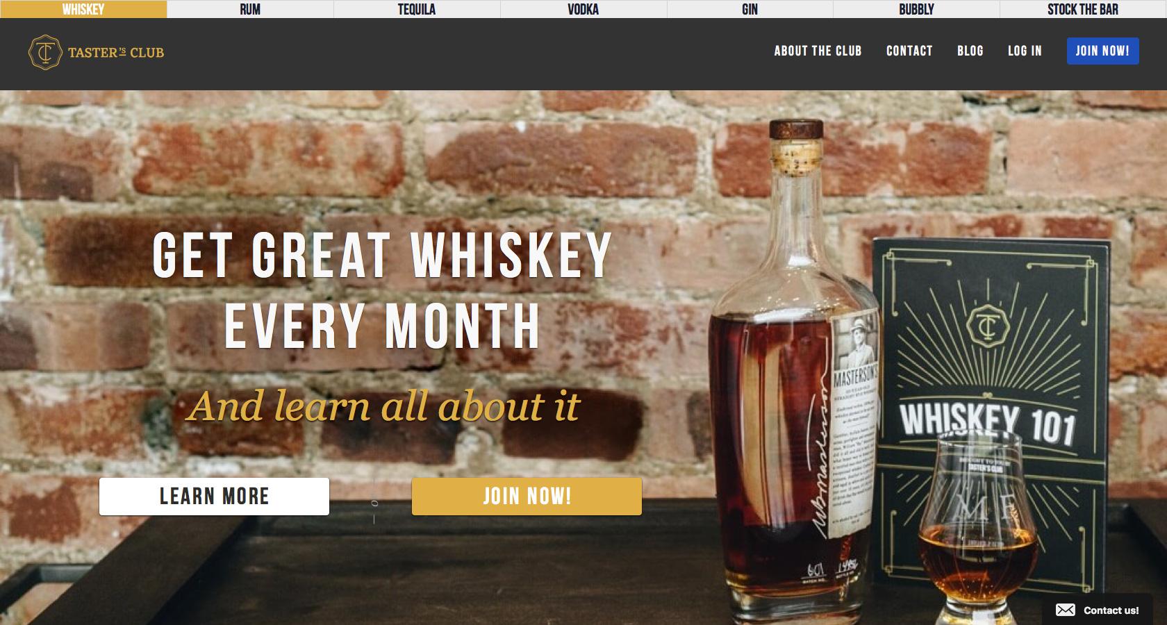
An effective landing page headline is:
- Persuasive and catchy
- Brief but clear, and states what problem it solves
- Conveys a sense of urgency
2. Strong Calls to Action
Call-to-action buttons are core components of a great landing page and act as the main gateway between your product or service and the user.
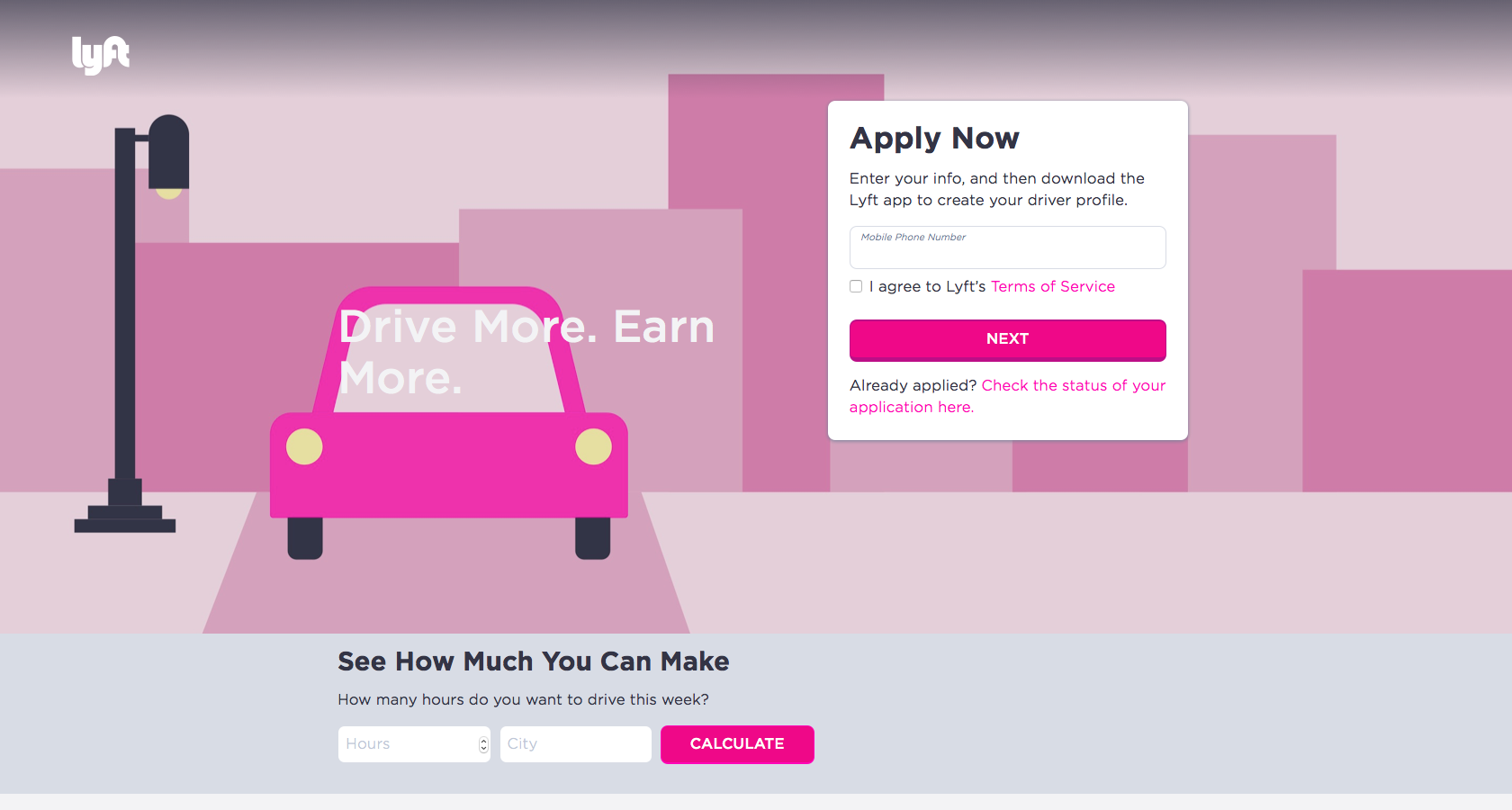
It’s possible to improve your CTA “button game” by applying these tips:
- Keep it above the fold and put emphasis on the primary CTA. Always make it easy for the visitor to perform the desired action.
- Use suggestive imagery and visual cues to point visitors towards the CTA.
- Use strong and bright colors that will make the CTA buttons stand out by creating contrast.
- Use natural and actionable phrases for your calls-to-action, such as “Start Now,” and “Get a Free Quote Now.” Avoid using simple phrases like “submit” and “send” because they are not as effective in terms of conversion.
3. Psychological Aspects
Every person is subject to psychological principles and rules. People’s motivations, desires, beliefs, and biases lead them to make specific choices. These choices are heavily affected by a variety of factors, conscious or unconscious, and there are ways to affect them:
- Make use of empathetic images that are relevant to the context of the user. This allows for a better connection at an emotional level and conveys feelings of empathy to the user.
- Key elements on the landing page, such as the headline and call-to-action buttons, should create value and a sense of urgency for the user. This can be achieved by writing appropriate copy and using contrasting colors.
- Widgets like trust badges, ratings, and awards should be displayed above the fold. This conveys a feeling of trust.
- Displaying relevant testimonials works as a social proof to visitors and increases credibility and trustworthiness.
- Showcasing logotypes and brands that have been involved with the service or product helps build trust by means of social proof.

4. Use of People on Landing Pages
Besides the various psychological aspects that can be used to get more out of a landing page, using people and friendly faces is a proven technique for higher landing page conversions.
Using pictures of real, everyday people instead of objects or stock images helps to create a more personal connection and elicit more empathy from visitors. Because people typically make their decisions at an emotional and subconscious level, creating an emotional connection through images is a very powerful technique.

Studies that explored the use of human images in web design found that websites which include facial features stimulate the perception that the websites are trustworthy and therefore more appealing.

Another great way to draw attention to CTAs is to use images of people looking at headlines and call-to-action buttons. This technique makes it easier for the user to see important CTAs and leads to higher-converting landing pages.
Common Mistakes in Landing Page Design
1. No Images or Low-quality Graphics
“A picture is worth a thousand words.”
– Proverb
Studies have shown that people perceive images better, and symbols over 1,000 times faster than text, emphasizing the need to use quality images and videos. Generic, pixelated, dated images and stock photography will hurt credibility, reduce trustworthiness, and make the landing page less authentic in a reader’s eyes.
2. Page Layouts with Too Much Content and Complexity
Landing pages are meant to be easy to use and quick to understand. Layouts that are too complex to scroll, hard to scan, and overloaded with UI elements rarely provide value and dramatically reduce landing page conversions. The decision to use common website elements like navigation bars, footers, and similar elements should be made on a case-by-case basis.

Understanding the user’s perspective uncovers the weaknesses in design more effectively, helps make the page flow more intuitive, and the process of scanning the landing page less difficult.
A/B testing a landing page is a good way to gather insights that can be applied toward improving a landing page layout. Another option is to use evidence-based UX design techniques, such as the F-Shaped and Z-Shaped pattern layouts.
These types of layouts have been thoroughly analyzed and backed up with data that show common user interaction patterns. Going forward, applying the data from research greatly enhances the ability of users to interact with a landing page’s content.

3. Unscannable Copy
Good copy on landing pages is essential for creating clear and intuitive experiences for visitors. Well-written copy is not only suggestive but also exciting. Writing copy for landing pages is in big demand because marketers, designers, and business owners understand the value of great copy.
An important principle in customer-centric copy is storytelling. Too much text, grammatical mistakes, large bodies of unbroken text, and a boring tone can lead to a poorly-performing landing page. Visitors will trust you more if they feel the copy is tailored to them and tells a compelling story.
This article is written by Stelian Subotin and originally posted at Toptal

