When designing a product, there are many ways to improve the user experience, including defining personas, well-structured information architecture, and thoughtfully written content. But after this high-level structure is set, creating delight for a user comes in the smaller interaction design details.
These details, known as microinteractions, are individual moments in the product designed to accomplish a single task while enhancing the natural product flow. Swiping up to refresh data, liking content, or changing a setting are all microinteractions. They can also include simple UI animations—for example, the way a menu slides in when tapped, or a card glides off the screen when swiped.
Often microinteractions aren’t even consciously noticed by the user, but their subtle details make the product more enjoyable and easier to use, and therefore improve its user experience.
Benefits of Microinteractions
Microinteractions and UI animation are so crucial they can make or break a design—or as Charles Eames, of furniture design and architecture fame, said:
“The details are not the details. They make the design.”
scrolling microinteraction
Scrolling microinteraction with contacts (by Nikita Duhovny)
Some key benefits of incorporating microinteractions into a product are:
Creating a positive emotional effect on the user due to smoother UI interactions
Providing immediate feedback to the user based on actions they’ve taken
Guiding the user through an app in a more fluid, intuitive way
Encouraging users to interact with an app by responding to a notification or when sharing content
Preventing user errors
Microinteraction Design Best Practices
Now that we’ve established some definition and context around what microinteractions do, and given an example of how they improve the user experience, let’s discuss the best practices for creating microinteractions.
eCommerce microinteraction
eCommerce product color selection microinteraction (by Mykolas Puodžiūnas)
Identify and Understand the User’s Problem
The first rule in any user experience design is to uncover and understand user problems—it’s no different for microinteractions. The best way to understand what the user needs is to conduct surveys or interviews, or observe behavior through user research. Toptal designer Ivan Annikov goes into more depth about understanding user needs in his article, “Going Guerrilla: Affordable UX Research Tips And Alternatives.”
Keep Microinteractions Natural
The goal is to bridge the gap between the user and a product in ways that feel intuitive and natural, so avoid strange animations that take too long to load or may distract the user. Instead, create designs that seamlessly flow with the product. Subtlety is key in microinteractions. Don’t leave the user puzzled and thinking, “What was that?”
eCommerce microinteraction ux pattern
An eCommerce microinteraction adding a product to the shopping cart (by Elior Helose)
Test and Iterate Findings from User Testing
Even experienced designers rarely get designs completely right on the first try. That’s why using a process of user testing and iterative design is a simple way to reduce usability flaws before the product launch.
During the user testing phase, microinteractions are tested and analyzed for usability and revised during the next design phase. This process is repeated until usability issues and pain points are corrected.
Follow the Structure of Microinteractions
According to Dan Saffer, a Sr. Staff Product Designer at Twitter and the author of “Microinteractions: Designing with Details,” there are four parts of a microinteraction.
Trigger — A trigger initiates the microinteractions. One type of trigger is a toggle switch that turns a functionality on and off.
Rules — A rule determines how a microinteraction responds to a trigger and defines what happens during the interaction. For example, a flashlight app uses a button as the trigger that turns the light on and off.
Feedback — Feedback tells the user what is happening during the microinteraction. An example of feedback is a signup form with inline validation—a border color turns green if the field is filled in correctly, and turns red if something is incorrect. This way the user instantly knows something is right or wrong.
Loops and Modes — Loops and modes define the microinteraction’s meta-rules and how the microinteraction changes when used repeatedly. For example, in eCommerce, a “Buy it now” button might change to “Buy another” when the user has purchased the item before.
friend request microinteraction ux pattern
A microinteraction to respond to friend requests (by Erdenebaatar)
Deconstructing Microinteraction Design
To show the thought process behind designing microinteractions, let’s deconstruct a microinteraction by Google: the file name suggestion microinteraction in Google Docs.
This microinteraction takes the first line of a document and suggests that piece of text as the name for the document, making the name creation process more intuitive.
Google Docs file name suggestion microinteraction
Google Docs file name suggestion
The process of designing a microinteraction is the same as for any design task: identifying the user pain point and fixing it. While keeping the previous best practices in mind, let’s start to identify the problem.
The User Problem
An easy and intuitive way to keep documents organized is to simply name them descriptively. In most text editors, the “Name your document” field remains blank, even though there is a strong chance the file name will eventually correlate with the document’s content. This is a process worth addressing with a microinteraction.
Google’s Solution
Google Docs handles this in two ways, depending on the user’s choices: 1) Users can click into the name field and change the document name right away before typing any content, and change “Untitled document” to the name of their choice, or 2) Once a user types the first line of text, Google autopopulates that as the document name. The user can keep this as is, or change it.
Let’s examine the details:
Triggers
There could be a few possible triggers to name the document, using the File > Save as menu function, or hitting cmd+s on a Mac (ctrl+s on Windows) on the keyboard as in desktop applications. But none of these take advantage of the interactive nature of the web, and they don’t particularly enhance the user flow.
Instead, Google Docs’ main trigger is to simply click the document name field. The hover state on the field displays a “Rename” tooltip. The secondary trigger is File > Rename, which highlights the name input field.
Google Docs “Rename” tooltip microinteraction
Google Docs uses a simple, yet very useful tooltip.
Rules
Rules define what happens after clicking the trigger. In this case, the first line of text will appear as the document name. But what if the user doesn’t want to have the first line of text as the name? When the user clicks the name input field, all of the text is selected and will be deleted with any keystroke, making it easy for the user to create a new name.
Google Docs highlighted file name microinteraction
Google Docs highlights the document name, which will allow the user to instantly start creating a new one.
Feedback
Changing the color of the input field border is a common interaction pattern, and it’s what Google Docs uses here to give the user immediate feedback.
Google Docs active border microinteraction
Changing the border color lets the user know what they’re changing.
Loops and Modes
The user successfully created the document name and the trigger remains in place with one key difference: The document has now been named.
At this point, the user may only want to only change a few letters or add a date to the name, rather than changing the whole name they previously defined. In this case, in contrast to the previous rule, the rule to highlight the entire document name is disabled.

Result
After defining the problem and focusing on all four parts of a microinteraction, the result is a more natural, user-friendly experience. The Google Docs file naming solution helps the user stay organized with properly named files and simplifies the process of naming documents.
Microinteractions in Action: Real World Examples
Reordering a Task List
Apple iOS Reminders help users stay organized and eliminate several steps by allowing them to tap, hold, and drag a list item to change its place in the list order.

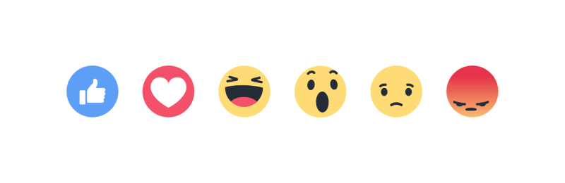
Reacting to Social Media Posts
“Liking” content by clicking a thumbs up button or icon has become a common UX design pattern in many apps and websites. Facebook built on this interaction by adding multiple options beyond “liking” through a subtle microinteraction.
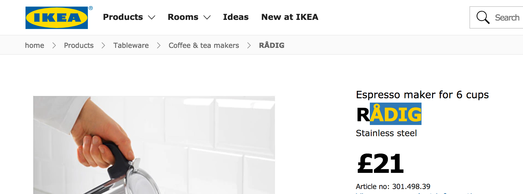
Branded Text Highlighting
In most browsers, it’s possible to override the default text selection color. IKEA uses this interaction pattern to add a subtle branding detail by highlighting text in its iconic yellow and blue colors.
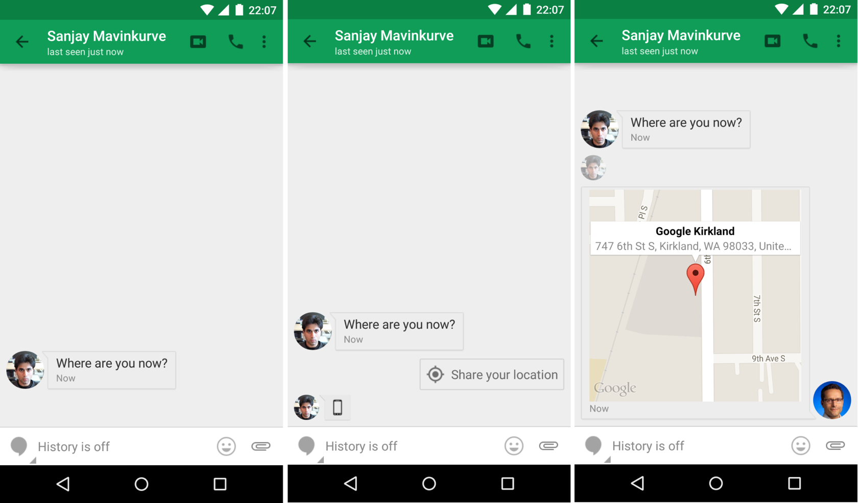
Sharing Your Location
Google Hangouts assumes that one of the times a user may want to share their location is when someone texts “Where are you?”
When the user views this message, a “Share your location” button shows up as a contextual option. They can then tap that button to auto-send a map of their location to the other user.
Swiping to Select
Microinteractions can be used to answer simple yes or no questions in an app. Tinder does this by having the user swipe left or right (no/yes) depending on whether they like or don’t like their possible match.

Search Expansion
The Google Inbox app not only intelligently groups mail with bundles, it’s also designed to allow search by voice, or choose from the most recent contacts with a single tap.

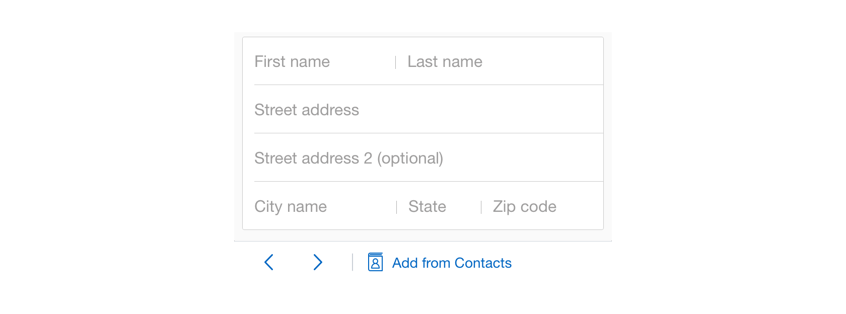
Speed-Adding a Friend’s Contact Information
SeatGeek simplifies the form-filling process by automatically filling in the information from a user’s contacts with a tap of an “Add from Contacts” button.
Learn More About Microinteractions
Microinteractions are a key part of improving the user experience, and there are many resources available to learn more about them, a few of which are listed below.
To learn more about microinteractions in general, visit Microinteractions, the website created as a companion for the previously mentioned book “Microinteractions: Designing with Details” by Dan Saffer. On the site, there are detailed explanations of microinteractions as well as information on the origin of well-known microinteractions, such as autocorrect, autocomplete, and cut and paste. The first chapter of the book is also available as a free download.
For microinteraction inspiration, visit Little Big Details, a curated collection of microinteractions in digital products. It shows examples of how companies like Apple, Trello, and StackOverflow implement microinteractions and UI animation.
To learn how to create microinteractions in Framer, read Toptal Designer, Wojciech Dobry’s article, Framer Tutorial: 7 Simple Microinteractions to Improve Your Prototypes.
This article is written by Ondřej Dostál and originally posted at Toptal