If you’ve been in the design world for a while, you’ve probably heard these terms: design framework, UI framework, UI kit, or pattern library. They all refer to the same thing—a system of design standards, templates, UI patterns, and components that are used throughout a product and serve its design language.
If you haven’t created a design framework before, starting one can feel overwhelming and seem time-consuming, but it will speed up your design work and make it more efficient overall.
Let’s outline the main issues a design framework solves, why you need one, and the components you will need to create when building one. You will find a free downloadable Sketch UI framework later in the article that allows you to create your own design framework.

What Is a Design Framework?
Every user interface design starts with an empty artboard, and every designer has a process they use to transform that blank canvas into a fully functioning product. This process includes all the small design components created, and the steps the designer goes through to build a cohesive whole, from colors to buttons and everything in between.
Often, this work is repetitive and can be consolidated and made more efficient by creating a system of interrelated patterns and components. In other words, a design framework.
Design frameworks solve several problems, including:
- Eliminating inconsistencies in the product design.
- Increasing collaboration, efficiency, and communication between design and product teams.
- Making design updates later in the design process less frustrating.
The First Problem: Inconsistency in the Product
Consistency transforms a good design into a great design. Consistency improves UX, general usability, and the efficiency with which users can use digital products. Whether it’s a small website, an app, or a large SaaS product, inconsistencies in design compromise the look, the feel, the credibility, and the user experience of the product.
Inconsistencies often happen when a team or a designer does things too quickly or makes changes on the fly. Sometimes a designer responds to a client or stakeholder asking for something different by quickly showing them what those changes would look like. Suddenly, the design team finds themselves with four different shades of green and no one is sure which one is the primary button color.
Design frameworks solve this issue by establishing consistent standards.
The Second Problem: Collaboration and Communication Gaps
Often during the development process when there are multiple team members involved with many working on the design at different points in the process, it can become confusing if there isn’t a set of standards to guide the team.
A design framework boosts collaboration and efficiency by streamlining the communication process and providing clear standards and direction. No more time lost running back and forth trying to figure out which color or font is the correct one to use.

The Third Problem: Late-Stage Design Changes
How many times do designers have to make a single color change in the design file with 120 artboards already developed? How many times is it necessary to change an icon that is a part of 200 components?
Change is inevitable throughout the design process, it’s how the product improves, but it often happens later than designers would like. A design framework makes those late-stage changes much less painful, because it’s built on a system of object-oriented components. Change it once and it ripples throughout the entire design.
How to Create a Design Framework
Now that we know what a design framework is and the problems that it solves, let’s talk about creating one (and what’s in the Sketch UI kit download provided later in the article).
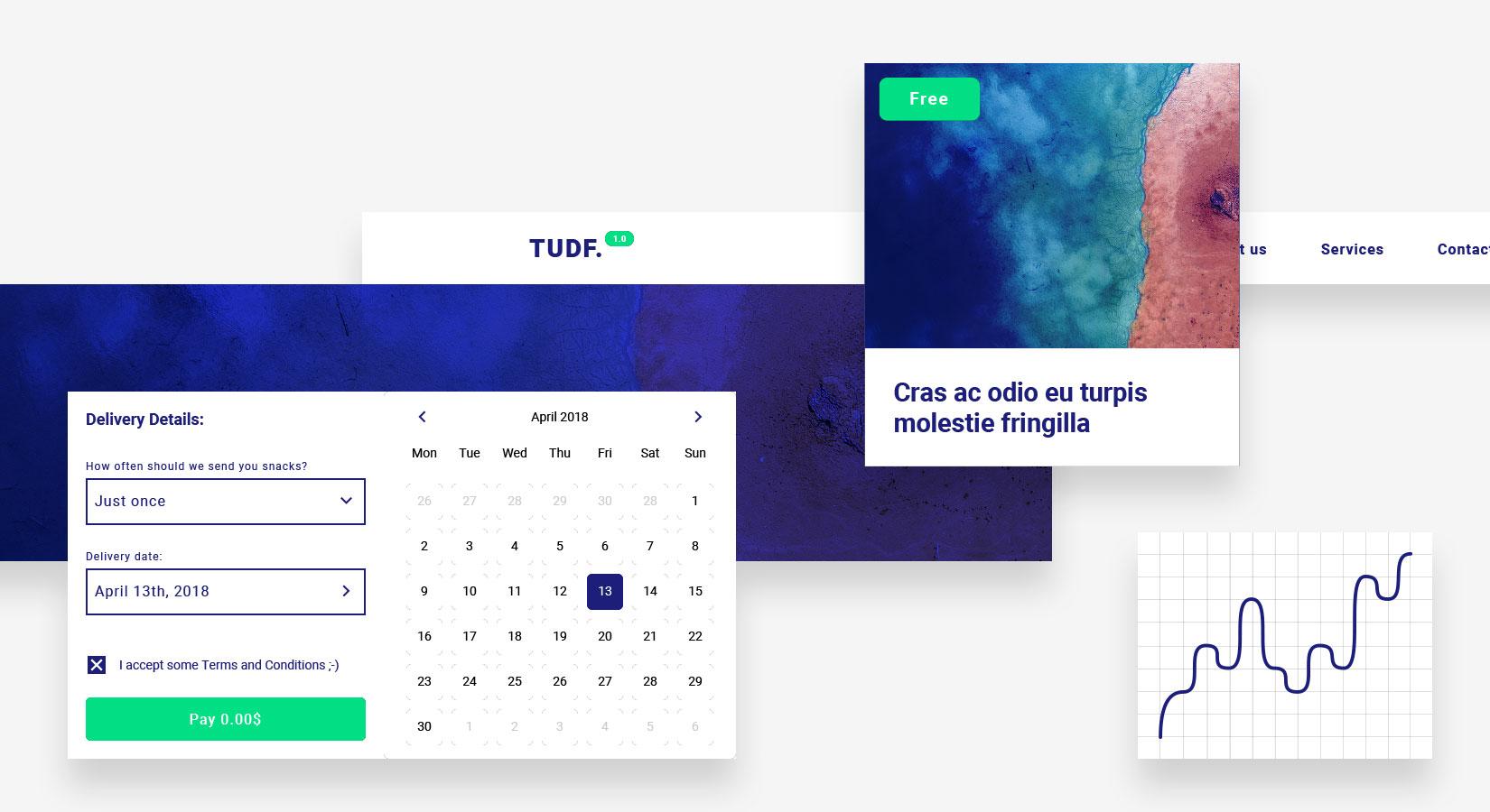
The design framework used for this article is a single Sketch file that is laid out using a specific hierarchy of components, known in Sketch as “symbols.” These symbols make it easy to implement file-wide changes with a single click. One change in the “master” component—the “symbol”—is reflected instantaneously in all other instances.
Design Framework Hierarchy
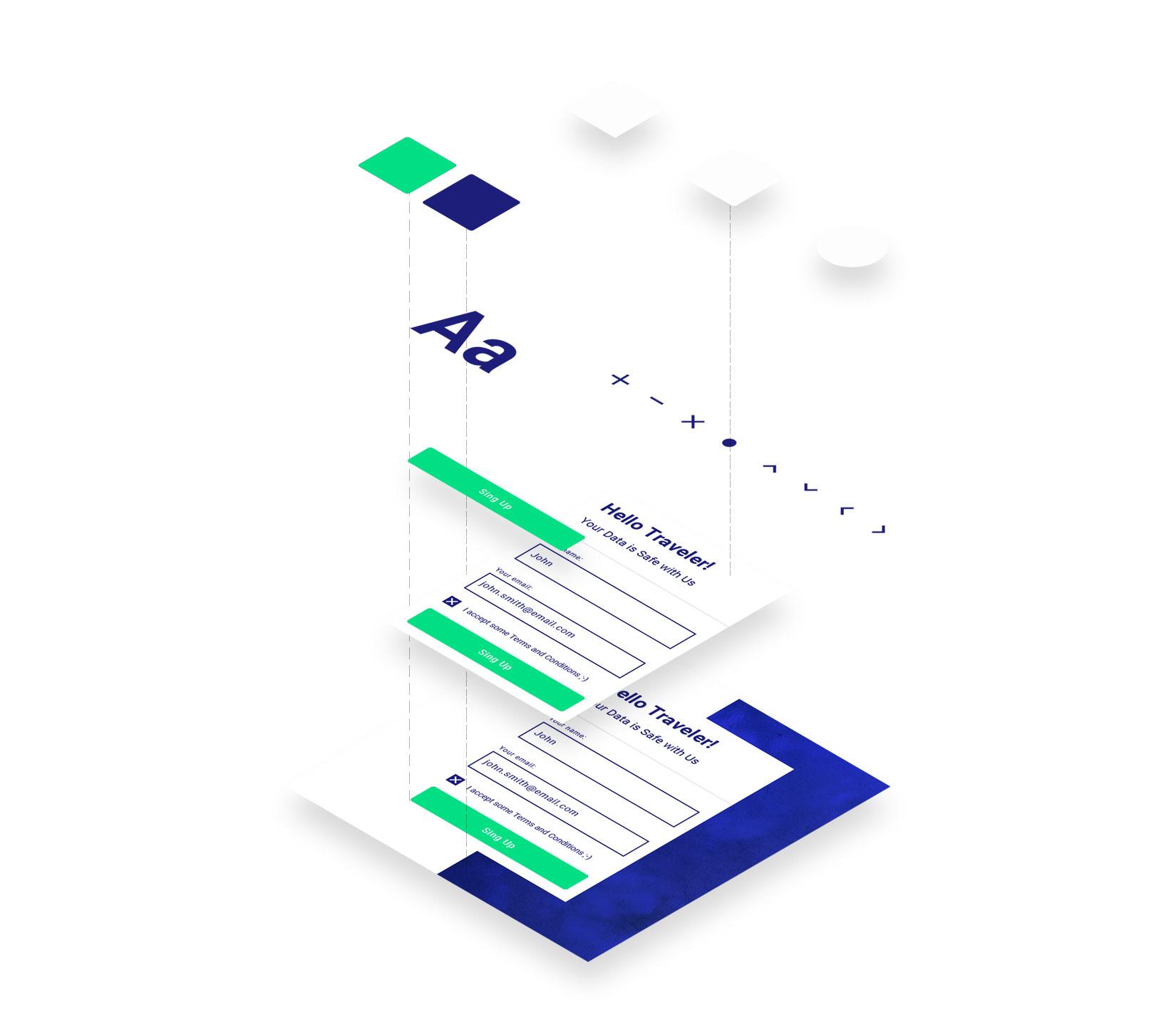
To create a design framework that works well, start by setting up a solid visual hierarchy. Design the most omnipresent components, like color and typography first. Then work down to smaller ones, like buttons and input components. Think of it like building a house—build the foundation first, and then add the other pieces as the project progresses.
Color
Color is the most important element in a UI design framework hierarchy—every single component in a design uses color. Color elicits strong reactions and emotions in people and sets the overall look, feel, and tone of a product.
A good practice is to divide colors into groups:
- Primary colors are the main brand colors, typically used to create the general color scheme of a project and for crucial components like buttons.
- Secondary colors complement the primary palette—often they’re different shades, saturations, or tints of the primary colors. Grayscale is commonly used for typography or backgrounds. Somewhere between five to eight levels of gray should be enough.
- System feedback colors are an important group that designers often forget about. These colors display system messages, including alerts, warnings, and notifications.

Grid: The Design Space
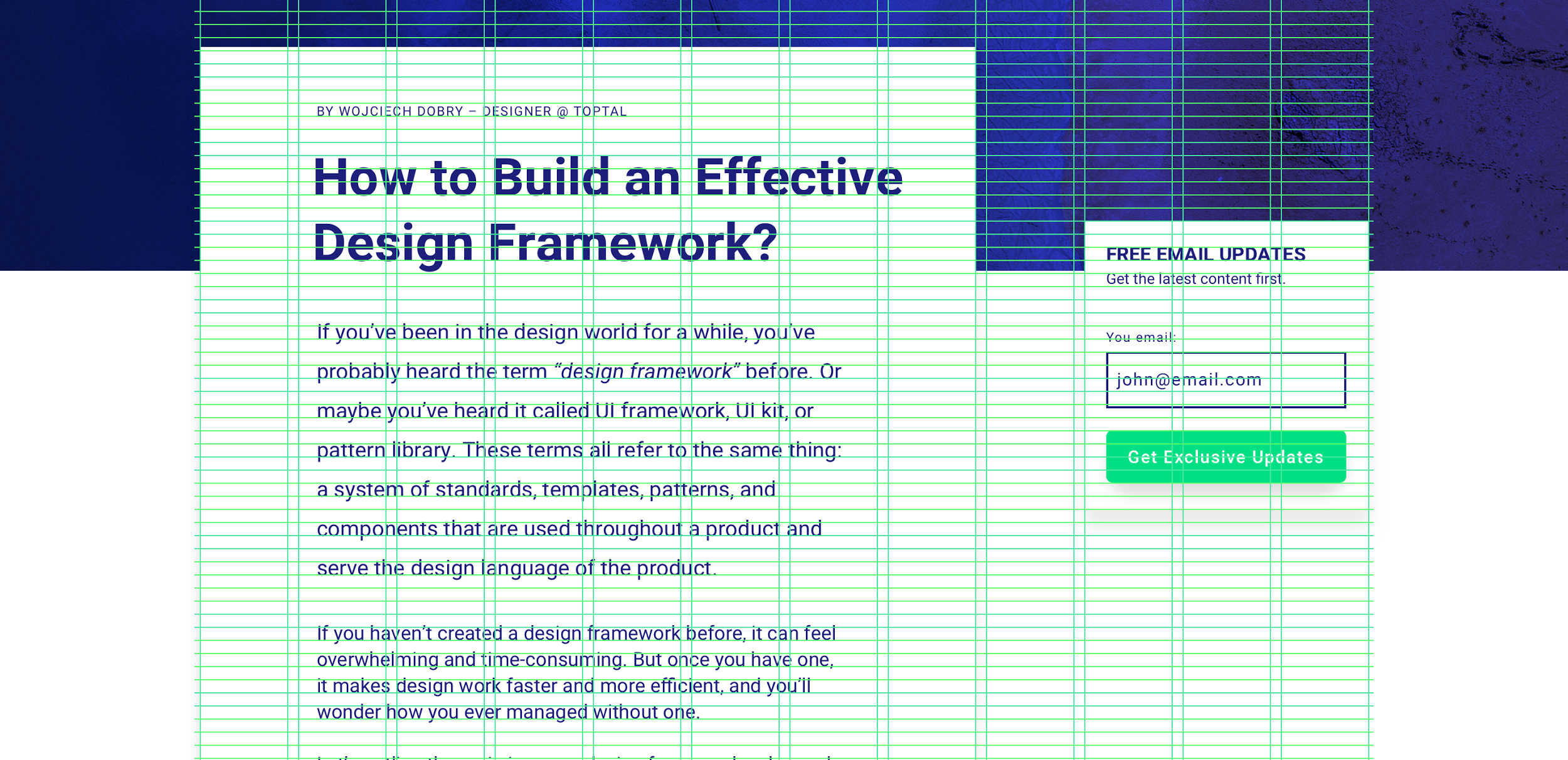
Once colors are selected, the next step is to set up a grid. A grid keeps all the other components on the page in the right place and order. This is the overall design space.
There are two types of grids: vertical and horizontal.
The vertical grid is the one that is most commonly used and keeps everything aligned horizontally. There are many popular grid systems like Bootstrap or the older 960px grid.
A horizontal grid isn’t that common. A horizontal grid is used for typography. It creates vertical rhythm for paragraphs and is commonly seen in newspapers.
Modifiers: Stylistic Rules
In addition to color and grid, there is one more component that is high in the design framework hierarchy: modifiers. They cannot be used as autonomous components—they are used to modify or style others.
This group brings style to a project and includes components responsible for aesthetics, such as shapes or shadows; changing them individually in the later phases of the project can be cumbersome.
Treat modifiers as parameters for all of the subsequent building blocks. Create Sketch symbols out of three different shapes: rectangle, rounded rectangle, and circle. Use these shapes to create every single component of a UI, including buttons, input components, form fields, etc. and background elements.
This technique allows designers to focus more on the UX rather than the appearance of UI components. It also makes it easy to go back to the basic shape, change its style (for example corner radius) and everything connected will update automatically.

Typography: The Content
Typography is the last important design framework component. It can be divided into two groups: static page copy, like headers and paragraphs; and interactive component copy, like buttons, navigation, or input fields.
Design the style and size of all the headings (H1, H2, H3, etc.) and paragraphs. Static page copy doesn’t usually have many stylistic (color or weight) variations. The only variation—as related to static page copy style—is whether it is on a light or dark background. Therefore, it’s best to create two sets of colors to make sure static page copy works on both.

Copy that appears on interactive components, like buttons or system feedback messages, can have multiple variations. For example, system feedback messages could be shown on four different background colors based on the message type (warning, error, success, etc.)—button labels can also be on different backgrounds.
Including this group in the design framework is helpful while thinking globally about typography. First, create the regular button label text, and second, create its variations; this will help avoid ending up with too many font sizes. When creating new UI components in the framework, always check to see if there is an existing typography style that fits.

Icons
There are two groups of icons in a design system: informative and user interface icons. The first group is typically part of an illustration system and not used for any UI interaction components (such as buttons). The second group—UI icons—add meaning to more complex components: buttons, labels, or tables, while taking up a very small amount of space. Icons in the UI can also be used as function triggers such as “edit,” “copy,” “download,” and “remove.”
Start with simple icons used for UI interactions, like arrows, “add” (+) or “close” (x). A good practice is to design them in different sizes (12px, 16px, 24px 32px).

Components
Buttons
Buttons are unquestionably one of the most important components in UI design, and over the years, they’ve gone through many changes as design trends have come and gone.
When designing buttons, make sure to design their individual “states.” As a rule, a button has multiple states and provides visual feedback to users to indicate the current state (idle, hover, pressed, disabled, active, etc.).
There are two ways to do this: the first is to design the appearance of buttons separately for each state (regular, active, hover, and pressed). This solution might be time consuming, but subsequently gives a lot of flexibility. (This method was used in the free Sketch UI framework included below.)
The second way is to design all states based on the initial one. For example, create one Sketch symbol that will change the color, saturation, or brightness of each state.
To do this, place the symbol as an overlay of the button with one of the Sketch blending modes: hue, saturation, or overlay. Use a black rectangle with hue blending mode over the regular button to change its saturation. Changing the overlay opacity later makes it a more or less saturated button.

Input Components
Inputs allow the user to communicate with the application and upload data. Using components such as input fields along with buttons allows the creation of a simple web application. As with buttons, it’s best to create input components with different states. It depends on the design framework, but at a minimum, consider creating empty, filled, and error states.

Complex Components
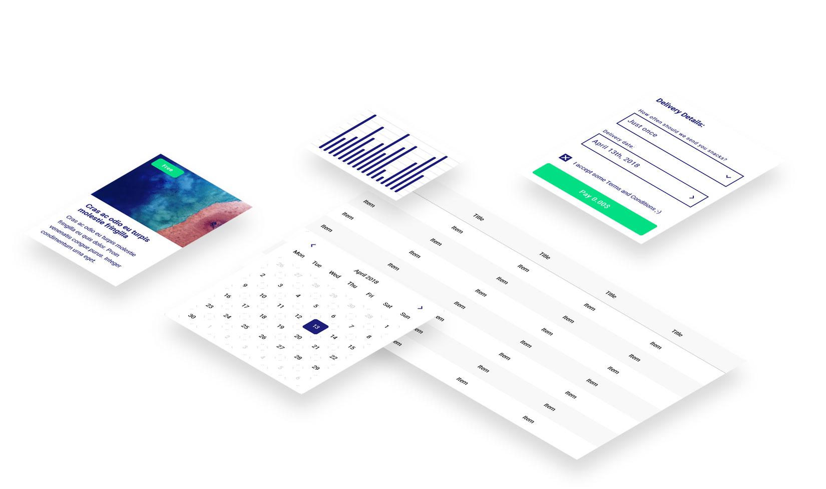
At this stage, the design framework could be considered complete because it has everything needed to create a functioning product. However, it is often worthwhile to spend some more time creating more complex UI components for the UI framework, such as cards, tables, datepickers, charts, and forms.
Sections
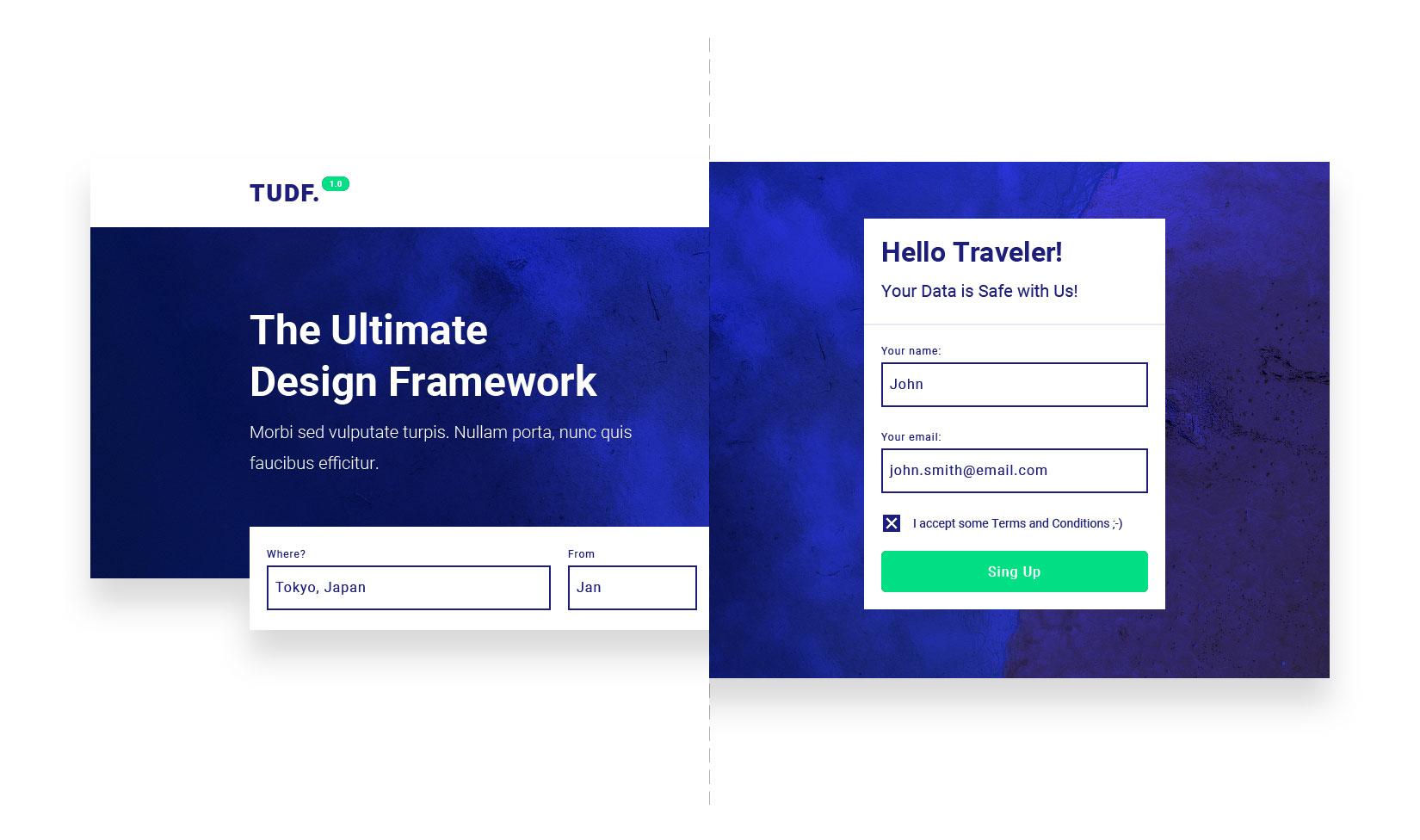
At this stage, the design framework can be developed further by creating the most common sections of applications or websites. By designing things like navigation, headers, an “about us” section, and galleries, a designer can save time in the later phases of a project. Creating several variations of different sections of the product will make it easier to adjust to different projects down the line.
Design Framework Best Practices
Constantly Test the Design Framework
Testing should be included in any design or development process. Avoid errors and missing components by creating small design pieces and “stress-testing” them. For example, check whether changing a component created at the beginning also changes a recently added component.
Create Simple UI Components
Keep components simple while thinking ahead to as many design use cases as possible, so in the future, any style can be covered. It’s best to create UI components with simple shapes, keeping them flexible enough to adjust easily to any project.
Don’t Focus on a Single Style
A design framework should be universal, so instead of focusing on a specific style, focus on components that can be used to create a style.
This article is written by Wojciech Dobry and originally posted at Toptal

