The following is a curated collection of beautiful and futuristic travel UIs created by different designers from around the world. Some of the designs are captured from live products, some are still in development, and some are purely concepts designed to push the bounds of what is even considered possible.
Note to designers: Some of the following contains fully developed open-source elements that you can use in your own designs.
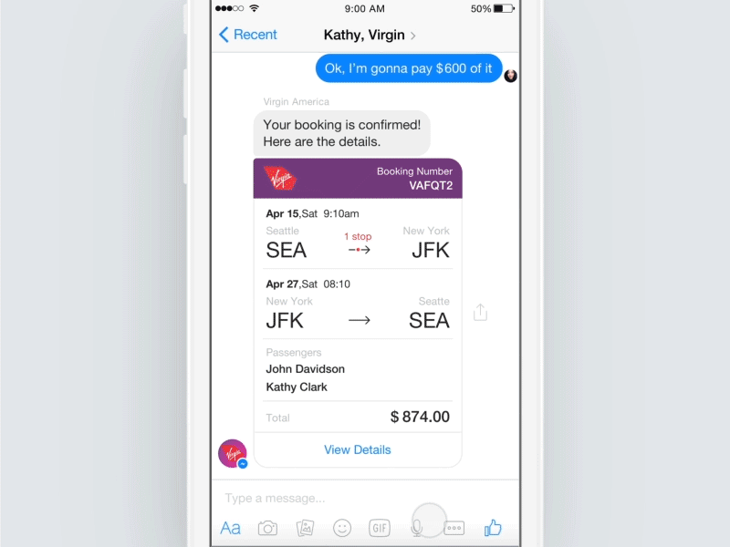
Facebook Messenger, Bots, Payments
Why it’s amazing:
This concept brilliantly leverages the current chatbot hype and applies it to a compelling use case: booking flights with friends. It takes a number of complex interactions and allows the group to search and book within the Facebook Messenger app.
Swipe to Travel
Why it’s amazing:
Starting with a simple question “Where do you want to fly from”, this concept makes deciding easy, by feeding you destinations with rich images and allowing you to swipe left or right, without even needing to know the exact travel dates.
The app is minimal, helping the indecisive make decisions more easily.
Ramotion’s Travel Onboarding App Concept
Why it’s amazing:
Transitions and animations bring this onboarding process to life. Having a muted color palette, and a highly stylistic animation style with subtle movement, helps create a unique user experience.
Multi-dimensional Controller by Leo Leung
Why it’s amazing:
The above travel UI concept is particularly compelling, new interaction patterns can allow users to view videos while still scrolling. It is part of an open-source controller that will change the way we consume video content.
Cloudy Parallax on Framer.js
Why it’s amazing:
This is an incredible example of what is possible with Framer.js. This is an example of Framer.js’ multitouch features and shows a slightly parallax video in addition to the multi-touch interactions to provide a full storytelling experience.
Landscape Transitions Galore
Why it’s amazing:
Switching a device to landscape mode can change the use case dramatically. This is a great example of modifications in interactions and animations that make the user experience particularly context-savvy.
Explore Destinations via Animated Cards
Why it’s amazing:
This minimalistic example illustrates an interesting interaction, which was apparently born from turning the designer being stuck for a great concept into a playful solution. It was later turned into a CSS-only concept on CodePen.
Timelapse Video Done Right
Why it’s amazing:
Time-lapse animations of cities take this interaction to the next level and build upon swipe gestures. The simple typography contrasts with the lively, animated images.
Quick and Clean Four-Dimensional Controller
Why it’s amazing:
Videos can continue to play while scrolling, swiping, and performing other complex gestures. Subtle, reverse transitions on the rest of the interface pair well with the video movement.
Streamlined Flight Booking Process
Why it’s amazing:
This concept shows how simple and quick the flight booking process can be. Such a process may be suited for a user experience which is focused on giving customers the best price and fastest booking process possible.
“The user simply enters basic travel details (destination, a number of passengers, tentative travel dates) and then the app shows a two-dimension calendar along with prices, so a user may choose the best fare based on flexible travel dates. The user then selects seats right then and there (with occupied seats marked with smiley symbols, just for fun). And then… presto… here’s your boarding pass. So that’s it: book, pay, fly!”
ToFind Smooth Transition Concept
Why it’s amazing:
This interface looks beautiful, thanks to the clean color palette and typography. The app also shows a large number of complex animations and interactions, which are executed with great detail and speed, to support in helping the user feel part of a journey. This extension of the open source controller is an impressive example of navigating using contextually relevant information.
Swipe Right, Animate, Enjoy the Show
Why it’s amazing:
Gradients are used in this example to make transitions feel smooth and beautiful, by transforming blocks of color into loading screens. This helps break up larger blocks of content once an interaction is made. Swipe gestures together with high quality images make this app look luxurious.
This article is written by Danielle Reid and originally appeared at Toptal